architecture

Moriyama & Teshima Architects imagine and re-imagine the Toronto Reference Library by stephanie calvet

This is an article I wrote for Canadian Architect magazine. Toronto Reference Library, circa 1977. Photo by M&T Architects.

The Toronto Reference Library (TRL) is the flagship of the world’s busiest urban library system. Occupying over 416,000 square feet, it is a landmark situated adjacent to one of the city’s liveliest intersections—Yonge and Bloor—at the junction of two subway lines. The TRL opened its doors in 1977. Designed by architect Raymond Moriyama, the robust five-storey building was clad in red brick, its mass scaled back by terracing the façade along the diagonal. Bands of mirrored glass suggested an inner world within. The narrow corner entrance, flanked on two sides by a colonnade, drew patrons into the building’s soaring interior. With escalating demands on the library system, the TRL recently completed an extensive five-year phased revitalization led by Moriyama & Teshima Architects, though its cofounder Raymond has since retired.

The renewal of the TRL presented an opportunity to create a library of the future for Torontonians: a technologically advanced public space to meet a growing need for innovation, research and collaboration. Outreach strategies include an expanding range of programming. Here, you can take a workshop, get a flu shot, publish a book, or make a 3D-printed model.

“The key,” says Raymond’s son Ajon Moriyama, who was partner in charge of the revitalization (he has since left the firm), “was creating as much flexibility—physically, operationally and socially—in the space as possible.”

A view of the extensive renovations made to the Toronto Reference Library by Moriyama & Teshima Architects.

The building buzzes from top to bottom. It is centred on a vast tiered atrium inspired by the Hanging Gardens of Babylon. The interiors are bright, airy and uncluttered. Over the last five years, a series of interventions were thoughtfully integrated: a refurbished gallery, a freestanding theatre, a cultural and literary salon seating 600, enhanced spaces for quiet individual study and group work. A double-height rotunda dedicated to special collections reinterprets the romantic feel of old libraries with a distinctly modern material palette of concrete, titanium and dark wood. Each venue provides opportunities for people to meet, interact and exchange ideas.

Special Collections. Image courtesy of the Toronto Reference Library.

While the TRL’s role as a social gathering place grows, the written word still lies at its core, both in physical and digital form. Over four million items reside on site—novels, periodicals, films and maps. The building employs concealed mezzanines to maximize overall storage capability, amplified through the use of space-saving compact shelves. Open-plan layouts were rezoned for easier self-navigation; stacks were reconfigured to facilitate research. The library continues to explore and adopt emerging technological tools to better monitor collections and support learning and discovery.

Beyond the rows of books and computers are labs and maker spaces—means by which the TRL helps drive digital literacy through experiential learning. Access to laser cutters and audio mixers turns patrons from content consumers into creators.

Toronto Reference Library

Toronto Reference Library - Rendering from original proposal. Image courtesy of Unbuilt Toronto 2.

The library’s re-envisioned design recalls Raymond Moriyama’s visionary initial design concept of a glass box, which the City dropped in favour of a brick-clad volume. The revitalization provides a more open and transparent interface with the street: a reading lounge invites glimpses in, a bustling café entices passersby. The formerly dark, deep entrance now takes the dynamic form of a rotated glass cube. At night, it appears as a glowing beacon. The building reclaims its corner site, its evolving mix of paper and pixels drawing from—and contributing to—the downtown milieu.

Stephanie Calvet is a Toronto-based architect and writer.

Faux Sunlight by stephanie calvet

Interior space illuminated by high tech LED skylight from Coelux Here is a technologically innovative light fixture that simulates the look of sunlight through a skylight. It is made from a material that mimics the light scattering achieved through the Earth's atmosphere. CoeLux wants to change our experience in spaces cut off from the outside. Different models recreate the warm, grazing light of Northern Europe or the dramatic light of the Tropics. It is currently being used in 'iceberg homes' —mega basements for the wealthy in London. But imagine it being used in hospitals, gyms, offices, and carparks. It could have some real impact when the price comes down...

Below is the full article from the blog PetaPixel. Photos by Michael Loos.

Interior space illuminated by high tech LED skylight from Coelux

There’s an innovative new light technology that’s trying to shake up the way people think about “artificial light.” In Italian company called CoeLux has developed a new light source that recreates the look of sunlight through a skylight so well that it can trick both human brains and cameras.

It’s a high tech LED skylight that’s designed to provide “sunlight” for interior spaces cut off from the outdoors. One of the main ideas behind it is that to create realistic sunlight, you can’t just simulate the sun… you need to recreate the atmosphere as well.

CoeLux turns a basement washroom into a passable alternative to a Mediterranean spa.

24347_2_coelux2

The scientists who invented the light figured out how to use a thin coating of nanoparticles to accurately simulate sunlight through Earth’s atmosphere and the effect known as Rayleigh scattering. It’s not just the color temperature that is the same — the quality of the light feels the same as well.

People who have had a chance to experience the skylight so far have been fooled into believing that there was an actual hole in the ceiling, and the sample photos on the CoeLux website come with a cautionary note: “The photographs on this site are real and unretouched. They are not computer renderings.”

The technology is designed for providing the appearance of sunlight to spaces that could use it (e.g. hospitals, gyms, offices, underground parking structures), but it seems photographers could also make use of it as well for an artificial sunlight source in a studio — especially people who work in places with unpredictable or limited sunlight. However, the price would need to come down first: CoeLux currently costs £40,000 (~$61,000) to buy and up to £5,000 (~$7,600) for installation.

CoeLux says future improvements will include the ability to change the position of the sun in the frame and dynamic color temperature of the sunlight.

coelux-large_0004_Layer-1

Wired magazine also has an article on this: A Nanotech Skylight That Looks Just Like The Sun Shining Overhead.

Big-box buyers become bookworms by stephanie calvet

Here is an idea that has been mooted post- Target Canada debacle. And it comes, indirectly, from its discount store rival Walmart, no less. After Walmart abandoned one of its retail stores in McAllen, Texas, the city decided to reuse the structure as a new main library. Reinvention in the face of adversity is a common theme these days. McAllen, Texas' new main library is located in a converted Walmart store. Photo by MSR.

Target Canada recently announced that it is packing up shop less than two years after opening 133 stores across the country. Some blame its failure in the Canadian market on anti-competitive pricing while others attribute it to a limited product selection (I've also heard "it didn't understand the complexity of the Canadian consumer"). It will be interesting to know what's in store for the slew of these newly vacant big-boxes in the 'burbs. In the meantime, ears are perked for 'liquidation sales!' Let's hope incoming Uniqlo fares better...

target-canada

South of the snowline, architecture firm Meyer, Scherer & Rockcastle (MSR) has created a highly functional, flexible library of 125,000 square feet, making it the largest single-storey library in the U.S.A. To give that some context, it is an area equivalent to nearly 2 1/2 football fields.

To start, the former Walmart store's ceilings were stripped and the interior and new mechanical systems were painted white to form a neutral backdrop for new patron and service areas, which are designated with colour and texture.

Within the sprawling volume, the designers created more intimate spaces introducing form, pattern, and light. All aspects –from the interior architecture, to the graphics, to the furnishings– work in harmony and relate to one another.

The library creates a much-needed intellectual and social hub that arguably brings more to the community than another superstore can. The new venue boasts 16 public meeting spaces, 14 public study rooms, 64 computer labs, 10 children’s computer labs, and 2 genealogy computer labs. Other features include an auditorium, an art gallery, a used bookstore and a café. There is even a Farmer's Market on the weekends.

Here is what the designers came up with:

Laser-cut wood ceiling plane runs the length of the building. Photo courtesy of MSR.

Super-graphic-clad ceiling pendants and lighting and flooring choices define spaces. Photo courtesy of MSR.

Inspired by the Fibonacci Series, the layout and patterns found in the childrens area mimic growth patterns in kids. Photo by MSR.

FLOOR PLAN: bisecting axes define program areas. Image courtesy of MSR.

There is a lot of talk these days of how libraries, large and small, are evolving in the face of the digital revolution, which is radically changing how we access and consume information. As we see in McAllen, libraries are prioritizing community engagement and facilitating new learning models. But that's a broader topic for another day.

To find out more about this project, click here.

Ice Fishing Architecture by stephanie calvet

(All photos below by Richard Johnson.) While the Canadian Maritimes are bracing themselves from Snowmaggedon 2015, we find someone who actively seeks out winter culture. Turning his attention from his usual commercial assignments, architectural photographer Richard Johnson travels coast to coast across Canada’s expansive landscape to photograph ice fishing huts.

For the last 8 years, Toronto-based Johnson has photographed 725 ice huts in 9 provinces. He shoots these wintry scenes on overcast days, so as to avoid shadows. When you factor in weather and time to scout out locales, he is left with only 2 weeks a year to capture these solitary figures.

Richard Johnson_Ice hut_Ontario-2

Richard Johnson_Ice hut_Saskatchewan-1

Richard Johnson_Ice hut_Saskatchewan-2

Richard Johnson_Ice hut_Manitoba-2

Richard Johnson_Ice hut_Manitoba-3

Each hut is photographed frontally, centred in a square format. The horizon line is a consistent strike across each image, represented by the distant shore or a row of faraway trees. This straightforward "objective" point of view recalls the architectural images or typologies of Bernd and Hilla Becher who documented edifices like cooling towers and storage silos.

Bern-and-Hilla-Bechers-Co-014

The minimalist approach of Johnson's photography invites viewers to compare and contrast the huts’ varying characteristics. Some enclosures are more engineered —a modified trailer tricked out with solar panels—while others are assembled ad hoc —a plastic tarp draped over a frame of two-by-fours. Though they generally adhere to the basic, archetypal house shape, regional idiosyncrasies emerge: 4’x8’ sheet plywood with little embellishment in Manitoba; popular sheet metal in Ontario; porch-fronted log cabins in Alberta.

Some of the quirkiest, most colourful huts can be found in the La Baie des Ha! Ha! region of Quebec. Eccentric decoration —faux wood panelling, sunflower decals, or camouflage— makes them stand out from the pack. Interiors typically contain wood burning stoves, a trough, and vents for cross-circulation. “It’s all about what you can reuse and repurpose,” says Johnson.

Richard Johnson_Ice hut_Quebec-2

Richard Johnson_Ice hut_Quebec-3

Richard Johnson_Ice hut_Quebec-1

Richard Johnson_Ice hut_Newfoundland-1

Richard Johnson_Ice hut_Storm

There is a broader 'urban' angle here. Temporary settlements of hundreds of ice huts exist in northern Quebec and Manitoba. Johnson’s panoramic series Ice Villages shows the structures in their larger context and how they relate to one another: some are laid out in a haphazard way, others arranged in a systematic fashion. The seasonal communities that sprout up often include hockey rinks, small eateries, and the odd maple syrup kiosk. Fishermen stay for a month at a time, revelling in the camaraderie while they cast their lines in lakes and bays.   It is their getaway.

Richard Johnson_Ice hut_Ice Villages-1

Richard Johnson_Ice hut_Snow Villages-1

Richard Johnson_Ice hut_Snow Villages-2

Richard Johnson_Ice hut_Ice Villages-3

Richard Johnson_Ice hut_Ice Villages-4

This is an ongoing project. Richard Johnson has yet to visit British Columbia and the territories. In the meantime, Ice Villages is on display at the Bulthaup Toronto showroom through April 2015. www.icehuts.ca

Screen Shot 2015-01-27 at 8.54.49 AM


Architecture on Film: Cathedrals of Culture by stephanie calvet

Architecture takes centre-stage in the 3D film Cathedrals of Culture, rather than its more usual background role. According to reviewers, this six-part documentary, directed by six acclaimed filmmakers, explores the cultural significance of six iconic and very different buildings from angles not seen before. Oslo Opera House

Spearheaded by German filmmaker Wim Wenders, the film asks the question: "If buildings could talk, what would they say about us?" Wenders builds on the 3D techniques he first employed in the documentary Pina. He is joined by Michael Madsen, Robert Redford, Michael Glawogger, Margreth Olin and Karim Aïnouz. Each lends a distinctive artistic approach to the project, exploring a day in the life of these “cultural machines” — the Berlin Philharmonic, the National Library of Russia, Halden Prison, the Salk Institute for Biological Studies, the Oslo Opera House and the Centre Georges Pompidou. Narrated by the imagined voices of the buildings themselves, the film ambitiously aims to uncover “the soul of buildings.” While The Guardian’s Oliver Wainright says it presents a “limited and internalised view of architecture”, as a formal exercise its camerawork and visual mastery is captivating.

Salk Institute for Biological Studies

The Berlin Philharmonic, an icon of modernity. Photo by Wim Wenders.

Centre Pompidou

The National Library of Russia, a kingdom of thoughts. Photo by Wolfgang Thaler

Halden Prison, the world's most humane prison. Photo by Heikki Färm.

Cathedrals of Culture premiered at the 2014 Berlin International Film Festival. Keep an eye out for its next screenings. In the meantime, see the official trailer:

http://www.youtube.com/watch?v=s3f52bMVWqw

Federico Babina’s illustrated series by stephanie calvet

CITY-01_905 Here’s a random injection of colour into your day from a guy who has unlimited material to draw from. Italian architect and graphic artist Federico Babina turns out dozens upon dozens of illustrations exploring the intersection of architecture and related design fields. His prolific collection of work straddles contemporary art, cinema, and music – even zoo animals. The roster in each series he produces reads like a kind of architectural Who’s Who: ‘starchitects’ like Jean Nouvel and Zaha Hadid feature prominently, as do modernists Oscar Niemeyer and Corb.

’A’ is shaped by the scooped profile of Alvar Aalto's Riola Parish Church roofline.

In the series entitled Archibet, Babina applies his interpretation of famous architects’ signature styles to lettering. He describes each letter as a “small surrealist building that becomes part of an imaginary city made up of different shapes and styles, all speaking the same language of architecture.” His illustrated alphabet is composed of these 26 individual works of art: ‘A’ is shaped by the scooped profile of Alvar Aalto’s Riola Parish Church roofline; ‘B’ is transformed by the deeply saturated spiritual spaces of Luis Barragán; and, Norman Foster’s technical prowess is captured in a monolithic, metallic ‘F’.

’B’ is transformed by the deeply saturated spiritual spaces of Luis Barragán.

The artist has honed a colourful illustration style that recalls vintage movie posters. To create his images he combines a collage of different techniques, from hand drawing to 3-D modelling and other visualization programs. For me, Babina’s whimsical studies summon up renowned American illustrator Charley Harper’s highly stylized wildlife illustrations, which capture the essence of his subjects with the fewest possible visual elements.

022108_charleyharper-767694

Babina continues his architecture-themed series with Archimusic, imagining architectural compositions inspired by famous musicians’ hit songs and styles. Here too, his selection of artists runs the gamut from classical music composers, to rock legends, to contemporary singer-songwriters. Among the twenty-something illustrations is a hot red electric guitar-shaped building in the characteristic style of Jimmy Hendrix and one that echoes the repetitive structures of Philip Glass’ music.

Babina draws structures inspired by musicians’ hit songs, style, and album art.

Babina is the Barcelona-based illustrator who produced Archicine, posters featuring iconic architecture from classic movies. His retro graphic style offers a fresh interpretation of the places where some of our favourite characters lived, such as the ultra-modern, ultra-unfriendly Villa Arpel in Jacques Tati’s Mon Oncle, and the striking mid-century redwood abode in A Single Man.

Babina’s version of Villa Arpel, the ultra-modern geometric house in <em>Mon Oncle</em>

Everything gets even further distilled in the series Archipixel. Here, the artist pairs famous architects and their buildings and renders them as pixelated cartoons, like vintage video game characters. The idea of the project, according to Babina, is to “represent the complexity of the forms and personalities through the simplicity of the pixel."

In Archipixel, Babina pairs famous architects and their buildings and renders them as pixelated cartoons. Here, Le Corbusier and the chapel of Notre Dame du Haut in Ronchamp are distilled down to the most basic technology, like vintage video game characters. According to Babina, the idea of the project is to “represent the complexity of the forms and personalities through the simplicity of the pixel.”

Switching gears entirely, Babina also imagines a new life for iconic buildings from the Catalan capital in his highly detailed Immaginario series. The Barcelona Museum of Contemporary Art (Richard Meier), Torre Agbar (Jean Nouvel), and the once-controversial Forum Building (Herzog & de Meuron) are wholly (re)contextualized here...

Screen Shot 2014-10-01 at 2.53.43 PM

Screen Shot 2014-10-01 at 2.49.35 PM

Screen Shot 2014-10-01 at 2.52.14 PM

While architecture junkies can collect prints and posters of Babina’s work, the artist has plans to turn his illustrated architectural series into a book. Check out his extensive portfolio at http://federicobabina.com/

NOTE: If you need to brush up on your architecture ABCs, this lively animation by architect Andrea Stinga and graphic designer Federico Gonzalez may help. The video depicts the best-known buildings of 26 famous architects, one for each letter of the alphabet.

[vimeo http://vimeo.com/56974716]

Case study in Planning for Higher Education Journal by stephanie calvet

The Society for College and University Planning (SCUP) published my case study/planning story: "A Transformational Gallery for Ryerson University’s Architecture School." It is my first contribution to an academic journal ---- happy for any feedback! Abstract: The Department of Architectural Science at Toronto’s Ryerson University was already committed to community engagement. However, the need for a permanent gallery provided a new catalyst. The collaborative nature of the integrated planning process presented the school with an opportunity to revisit its public programming mandate. The school’s transformation, through the innovative physical positioning and use of the gallery, deepens its dialogue and level of engagement both within the University and the greater community.

The full article can be downloaded here.

PHEV43N1_Article_Transformational_excerpt

Paul H. Cocker Architecture Gallery, Department of Architectural Science, Ryerson University. Photo by Shai Gil.

Recalling Lake Ontario’s lost edge with steel and grass by stephanie calvet

A version of this post appeared in the October 10th edition of The Fort York Foundation's website. For more information, see www.fortyorkfoundation.ca/. The much-anticipated Fort York Visitor Centre is now open – to positive reviews.

The long, linear building recreates the lakefront bluff that defined the Fort’s 19th century geography and has taken root below the hulk of the elevated Gardiner Expressway. Its main exterior façade is composed of a sequence of monolithic weathered steel panels and a ”liquid landscape” of meadow plants, aligned with the contours of the original shoreline. The Visitor Centre inhabits the space behind this industrial escarpment, partially buried under the Commons. It is an ingenious approach to working with the landscape as a form of historical narrative.

Forecourt space will be planted in tall grasses with boardwalk circulation routes, recalling the original lakeshore landscape. Photo by Stephanie Calvet.

The building is a joint project by Vancouver's Patkau Architects and Toronto-based Kearns Mancini Architects – the result of an international competition held in 2009.

There is a remarkable similarity between the winning competition drawings and the final building. This is rare. Although the project underwent a comprehensive value engineering process, the original concept was not diminished nor was a more conventional approach to design taken.

Conceptual Sketch of the steel escarpment. Image courtesy of the project team.

The ‘fortified’ edge of the site is defined by steel panels. Photo by Stephanie Calvet.

Fort York Visitor Centre winning competition drawings - Perspective

The most significant change was in the superstructure –the "Ghost Screen"– a self-supporting layer that proved to be expensive and difficult to turn into an implementable piece of construction. Without compromising the essential imagery, the screen is (re)presented instead as a semi-translucent cast glass channel wall, which defines the building's uppermost volume along its length. “We decided to get more pragmatic about it”, says Patricia Patkau. “I think in some ways the project may have benefitted from that.”

A very rich landscape idea was presented as part of the winning submission, reflecting the historic harbour and telling the story of the site. Budget constraints, however, made certain key features undeliverable. These enrichments can be added as more funding becomes available.

Fort York Visitor Centre –Transversal section through the building and site.

To complete the weathered steel façade, an additional 37 inclined panels need to be installed. This extension of the wall from the east end of the Visitor Centre would demonstrate how the natural escarpment contributed to the Fort’s defences. As part of the liquid landscape, expanses of softly moving grasses will continue all the way along this steel edge, creating the illusion of the lake that, until the 1850s, came right up to the Fort itself. A series of illuminated raft-like objects and boardwalk circulation routes will help recall the former presence of the lake.

The full master plan also calls for a large terrace –"Events Dock"– reaching out into the liquid landscape. This will be the site for a slew of activities and here, at its highest elevation 20m up, the massive concrete and steel overpass will act as a huge covered canopy. (Just this past weekend, it was the site for a video installation during Nuit Blanche.) Imagine art installations hanging from its underbelly, and space for theatre, for concerts, and for kids to play. This is where the Fort York National Historic Site welcomes the modern city with diverse large-scale public events.

The new urban plaza will transform the previously derelict and underused space into a bright, new, urban neighbourhood amenity. Photo by Stephanie Calvet.

Fort York Visitor Centre winning competition drawings - Perspective

“There is a long list of enhancements that are not essential to the scheme but will make it richer. We hope that, over time, they can be phased in,” says John Patkau. After all, these details are the elements that we interact with most closely – they are the parts we see and touch.

The main façade of the visitor centre recreates the original escarpment and presents a strong elevation along Fort York Boulevard. Photo by Stephanie Calvet.

Fort York Visitor Centre winning competition drawings – South Elevation

The building is the result of a collaborative partnership between two innovative firms. It is not always obvious how two design firms can act as a team. In this relationship, there was no ‘master sketcher’, no single person taking the lead. The idea of the architect as solitary genius is outdated. Instead, it was a discussion, a conversation at all stages. “It's two complimentary, compatible design firms that are able to work together”, says Jonathan Kearns. “It’s almost like having a built-in peer review. We have a shared understanding and common goals." Toronto-based landscape architecture firm Janet Rosenberg & Studio was also an important part of the discussion.

The Fort York Visitor Centre will help Torontonians engage in the history of this site and the city. The designers, City of Toronto Culture, and community partners are committed to seeing some of the important missing elements that were described in the competition come to fruition. It’s just a question of when. The Fort York Foundation will continue to campaign and will need your support to realize this vision.

The canopy of the Expressway produces a huge, covered urban space for community events and programming. Photo by Stephanie Calvet.

The project's main façade is intimately interwoven in alternations of transparency and solidity. Photo by Stephanie Calvet.

Stephanie Calvet is a Toronto-based architect and writer specializing in architecture and design. For over a decade she worked in architecture and planning firms in Boston, designing projects in the hospitality, multi-unit residential, education and healthcare sectors. In addition to consulting, she writes for the popular press, trade publications, corporate organizations, and academic journals.

Nuit Blanche: Toronto’s all-night exploration and celebration of art by stephanie calvet

Nuit Blanche_Toronto 2014 It is art, collaboration, dialogue, and discovery. For one night only this Saturday October 4th from sunset to sunrise, Toronto will once again become the hive of activity that is Nuit Blanche. City spaces and neighbourhoods will be transformed by temporary exhibitions, installations, design, film, performance, and live talks.

Nuit Blanche was conceived in Paris in 2002 in an attempt to make contemporary art more accessible and engage the audience to examine its impact on public space. Toronto was the first North American city to fully replicate the Paris model. The international success of the festival has expanded its reach to sleepless cities around the globe – from Riga to Melbourne, Kyoto to La Paz.

Now in its ninth edition, Toronto’s Scotiabank Nuit Blanche showcases more than 120 projects created by over 400 local, national and international artists. Below is a small sampling of what you can discover…

Piece by Piece

Clare Twomey

Installation 'Piece by Piece' by leading ceramic artist Clare Twomey. Photo by Sylvain Deleu

Internationally renowned for her interactive interventions in prestigious British and American museums, Clare Twomey creates a spectacular commissioned performative installation about making and collecting, to honour the Gardiner Museum’s 30th anniversary. Piece by Piece features an army of over 2,000 ceramic figurines – inspired by the Gardiner’s rare Commedia dell’Arte Harlequin collection – that demonstrate the conflicting emotions of everyday life. During the exhibition, her Canadian premiere, an on-site artist/maker will create more statuettes to add to the ever-growing ghostly white world.

The Garden of Renova

Luigi Ferrara and The Institute without Boundaries

Nuit Blanche Toronto_2014-The Garden of Renova_3Renova’s coloured and scented toilet paper line is the raw material in a temple-like environment reminiscent of a garden of earthly delights. Using the bathroom tissue over substructures, the installation features a labyrinth, hedges, poppies, garden ornaments, and a 3D-printed fountain. Creator Luigi Ferrara, Dean of the Centre for Arts and Design at George Brown College, and his team at IwB invite the public to interact with the paradise surroundings.

Nuit Blanche Toronto_2014-The Garden of Renova

LandMark

Multiple Artists

Nuit Blanche Toronto_2014-LandMarkCurated by Exhibit Change, LandMark is an interactive photographic installation focused on the dynamic nature of community engagement and city building. Large-scale photo essays showcased throughout St. James Park share stories of some of the city’s unsung heroes and reveal the many layers of Old Town Toronto’s history. The initiative seeks to strengthen community partnerships in the St. Lawrence Market neighbourhood.

Walk among Worlds

Máximo González

Walk among Worlds_2013-UCLAIn this immersive installation Argentine artist Máximo González explores the effects of light and lightness, while reflecting on the political divisions of the world. The piece is composed of 7,000 beach balls printed to resemble globes; each representing one million of the inhabitants of the planet. The globes, made of a petroleum derivative, require the introduction of human breath to give them their geoidal shape. They come in three different sizes, alluding to the concepts of “first” and “third world.”

Good News

Antoni Muntadas

Nuit Blanche Toronto 2014_Antoni MuntadasBarcelona-based Antoni Muntadas is considered one of the pioneers of media art and conceptual art in Spain. This installation examines the duality of media as a source of information and an instrument of manipulation. The piece displays a wide range of headlines in order to incite the viewer into rethinking the meaning of the messages, creating a defiance in the uniformly constructed "media flow". A stream of information engineered by advertisers is to be consumed as a whole.

Melting Point

LeuWebb Projects

Nuit Blanche Toronto_2014-Melting PointIn the sound and light installation Melting Point, Fort York's two south-facing cannons are stocked with "an artillery of glowing good feelings", pouring forth "sparkling tributaries of light". The work reflects on the drivers, both cultural and natural, that have shaped the historic site – a preserved battlefield surrounded on all sides by condominium towers, raised freeways and train lines. Accompanied by the immersive sounds of rolling waves and trilling harps, LeuWebb's project lays a defense against the swirling market forces beyond, countering hard with soft and dark with light.

Solar Dehydrator

José Andrés Mora

Nuit Blanche Toronto_2014-Solar DehydratorToronto Hydro searched for artists to submit proposals for a contest to repurpose an old fridge, in support of their Fridge & Freezer Pickup program. Mora’s winning design, inspired by the appliance’s already existing insulation and components, transforms the refrigerator into a solar dehydrator.

Project REACH

Student artists from the Toronto Catholic District School Board

Nuit Blanche Toronto_2014-Project ReachProject Reach is a collaborative installation authored by students from 201 TCDSB schools across the GTA celebrating the value of charity and how it transforms lives. Visitors are greeted with hundreds of human hands – symbol of our ability to reach out and change the world. They beckon us to come closer to discover what these students want to communicate through personal messages, imagery, and found objects.

Implied Geometries

Valerie Arthur

Nuit Blanche Toronto 2014-Implied GeometriesIn Implied Geometries, Valerie Arthur seeks to uncover the otherwise invisible characteristics of a place. By simultaneously recreating all of the flight paths in a series of tennis games it will reveal the space within the court as much more than an empty void. The court will become a web of movement and speed, exposing the underlying forces that truly define it and inviting the audience to experience moving through the courts in a new way.

Wisdom of the North: Moose Cree and Attawapiskat

Johan Hallberg-Campbell

Nuit Blanche Toronto_2014-Johan Hallberg-CampbellThis exhibition presents a photo essay documenting the time artist Johan Hallberg-Campbell spent alongside the Canadian Red Cross, photographing volunteers working in the communities of Moose Cree and Attawapiskat. These images include engaging large portraits, vast landscapes and touching personal moments captured by one of Canada's leading photographers.

Global Rainbow

Yvette Mattern

Nuit Blanche Toronto_2014-Global RainbowThe high specification laser light projection Global Rainbow will blaze through Toronto’s night sky. From Chinatown to the CN Tower, it will cast beams of colours up to 60 kilometres. Created by New York- and Berlin-based artist Yvette Mattern, it has been displayed in cities around the world since 2009. It literally "paints the sky" with seven simple but distinctly powerful lines of colour representing the rainbow spectrum to create an artwork that is performative, sculptural, painterly, and minimalist in form. As a powerful and luminescent symbol of peace and hope, it embraces geographical and social diversity.

June Callwood Park

gh3

Ure-tech surfaces colour much of June Callwood Park. Photo by gh3.

Amongst Nuit Blanche’s one-night-only discoveries is the opening of a new permanent space in the city, the June Callwood Park. The gH3-designed park slots trees in amongst pavers, garden strips, and high-tech cushioned pink surfaces all laid out in the waveform of journalist and activist June Callwood speaking the words "I believe in kindness." Montreal artists Steve Bates and Douglas Moffat created the accompanying sonic public art installation, OKTA, transmitted by speakers arrayed throughout the grove.

This year, organizers have expanded the event into new neighbourhoods, including Chinatown, Fort York and Roundhouse Park. The festivities kick off at 6:53pm. For the full schedule of events, see www.scotiabanknuitblanche.ca

Toronto's Fort York Visitor Centre Opens by stephanie calvet

A version of this post appeared in the September 19th edition of UrbanToronto Entry to Fort York Visitor Centre, framed by a weathering steel panel façade. Photo by Stephanie Calvet.

The Official Opening of Toronto's Fort York Visitor Centre was held today. By most definitions, the city’s newest attraction, which is embedded into the ground, makes a bold statement whilst being minimally intrusive. The project is the result of a collaborative partnership between two design firms, Patkau Architects, an innovative studio based in Vancouver, and local associate architects Kearns Mancini.

"Right from the beginning, my feeling was that it could not be a little building sitting here because it would just look trivial beneath the Gardiner,” says architect Patricia Patkau. “Somehow it had to take on a different persona, like a landscape. It needed to be something of great scale, but without the height.”

Fort York Visitor Centre below the Gardiner Expressway. Photo by Stephanie Calvet.

The north façade of the Fort York Visitor Centre with the Gardiner Expressway above and behind. Photo by Stephanie Calvet.

Built in 1793, Fort York, now a National Historic Site, is known as the location where the Battle of York came to its violent climax in 1813 during the War of 1812. Today it is home to one of the oldest collection of fortifications in Canada, enclosing the country’s largest collection of 1812-era military structures within its defensive walls. Where the Fort is powerful in its history, it is not in its physical presence. Characterized by low-lying buildings, on a site landlocked between roadways and rail corridors, it has been almost invisible to passersby. Many Torontonians are not even familiar with its existence.

The Visitor Centre now changes this balance. Located on Fort York Boulevard, almost immediately below and just north of the elevated Gardiner Expressway, it acts as both a gateway and an interpretative hub for the entire 43-acre Fort York National Historic Site, considered the birthplace of Toronto. The new building is itself a key component in the ongoing restoration and revitalization of the city’s founding site, which includes not only the seven acres within the Fort's walls but also the archaeological landscape, Garrison Common, Victoria Memorial Square, the Fort York Armoury and Garrison Creek parkland to the east. For the architects, the building was not simply seen as a Visitor Centre but an opportunity to provide a sense of connection both historically and physically with other parts of the site.

The Visitor Centre's interpretive function is a key part of a plan to revitalize the entire 43-acre historical site.

The 27,000 square-foot Visitor Centre provides Fort York’s first secure exhibit space and enables the display of artifacts from the City’s collection that tells its 200-year story. Its green roof is an extension of the Common. Ground-embedding the building made it sustainable from an energy perspective and easier to develop as a Class A museum-quality interior: well insulated and unaffected by daylight. Toronto exhibit designer Reich + Petch also had a hand in shaping the environment, which includes a 2900 sq. ft. exhibit gallery; a climate-controlled vault designed to display iconic and light-sensitive artifacts; and, an Orientation Theatre. In addition to permanent and changing exhibits, it also provides facilities for education, research, staff and community use.

Fort York Visitor Centre Exhibit Gallery with 'The Vault' in the background. Photo by Stephanie Calvet.

Architects Jonathan Kearns and John Patkau introduce the Fort York Visitor Centre. Photo by Stephanie Calvet.

The Visitor Centre snakes along the base of the monolithic structure that looms above. It aligns with the original shoreline of Lake Ontario, now set back some 500m, altered by two centuries of infill. Lined by a series of inclined Corten steel panels, its main façade recalls the original lake bluff, which contributed to the Fort’s natural defences. The modularity of those weathering steel panels, in considerable 8’x24’ proportions, is broken by sections of glass at building entry points. An array of glazed slits between the panels, along the length of the building, allow thin segments of natural light to permeate the main reception area and sunken exhibition gallery.

The new Fort York Visitor Centre. Photo by Stephanie Calvet.

Entrance points to the new Fort York Visitor Centre. Photo by Stephanie Calvet.

The building’s workings are best illustrated in section. “This is sort of an ‘upside down’ landscape, in terms of its archaeology, where the visitor enters on a lower contemporary landscape and rises up into an archaeological landscape. It is an interesting inversion of how it usually happens. The history, then, is the upper landscape and the modern world is the lower landscape,” explains architect Johnathan Kearns.

Cross-section through the Visitor Centre. Image courtesy of Patkau Architects.

Longitudinal sections through the Fort York Visitor Centre. Image by Patkau Architects.

The procession through the building tells the story. The immersive "time tunnel", a digital media space along a gentle inclined plane that zigzags back, takes the visitor through a virtual re-enactment leading up to the Battle of York. When emerging out of the end of it, the visitor is directly facing the Fort itself, with the backdrop of modern-day Toronto. Visitors can then go forth and explore the Fort, armed with a deeper understanding of its background and an appreciation of its importance as a national historic site.

Existing Fort York site with Toronto's skyline beyond. Photo by Stephanie Calvet.

Hosted by The City of Toronto, The Fort York Foundation and The Friends of Fort York, the Opening Ceremonies began with fife and drum music by the Fort York Guard Drum Corps under the Gardiner Expressway. The musical prelude was followed by a welcoming and remarks by dignitaries, and then the ribbon cutting. On Saturday and Sunday, from 12 to 7pm, at the On Common Ground Festival, the public is invited to experience a free weekend of performances and exhibitions with culturally diverse music, dance, theatre, craft-making, kidzone, community village and local food. For a full schedule of events, please see link.

The Centre is open but not quite finished; visitors will find that several exhibits have yet to be installed, and most of the landscaping remains to be started, let alone completed. A number of enhancements will be added as more funding becomes available. In particular, the full master plan calls for the placement of an additional 37 steel panels to recreate the escarpment, and expanses of softly moving grasses recalling the waters of the lake. And the project team envisions the extension of a large terrace under the Gardiner that, here, at its highest elevation, will act as a covered canopy for a great diversity of public events. Still, there is much to see now, and celebrations continue.

The Gardiner shelters a huge covered event space. Image by Patkau Architects.

South elevation of the Visitor Centre, below the Gardiner Expressway. Image by Patkau Architects.

Stephanie Calvet is an architect and a writer specializing in architecture and design. She can be found at www.stephaniecalvet.com

Athletes at Home in Toronto's 2015 Pan Am Games Aquatics Centre by stephanie calvet

A version of this post appeared in the September 10th edition of UrbanToronto The Toronto Pan Am Sports Centre (TPASC) located at the University of Toronto Scarborough campus began operating this week. Under the official name “CIBC Pan Am/Parapan Aquatics Centre and Field House,” the venue is the largest sport new-build for the 2015 Pan American/Parapan American Games set to take place in July.

Co-owned by the university and the City of Toronto, the $205-million centre is the sole aquatics facility in the region that meets the latest international competition standards and represents the largest single investment in Canadian amateur sport history. It will play host to the Games’ swimming, diving, fencing, modern pentathlon, sitting volleyball and roller sports events.

The Toronto Pan Am Sports Centre. Photo by Stephanie Calvet.

The Organizing Committee (TO2015) and its partners set out to create an inspirational beacon for health and sport. Designed by NORR Architects of Toronto, the LEED Gold building provides “world-class” training facilities and a venue to host national and international competitions. It is also home to Canadian Sport Institute Ontario, which provides science and sport performance services to high performance athletes and their coaches.

But once the Games have concluded, the facility will become joint campus-community recreation space for university students and Scarborough residents to use and enjoy, while giving youth a place where they can train, play, gather and compete. “From our perspective as a university, we believe we can do a lot with community engagement. Many areas around here were former priority neighbourhoods with no facilities. The hope is that this centre attracts people, that they feel connected to a university and that it creates opportunities for them to set goals they might not otherwise have had,” says Andrew Arifuzzaman, UofT Scarborough Chief Administrative Officer.

Competition pool at the Toronto Pan Am Sports Centre. Photo by Stephanie Calvet.

The Aquatics Centre includes two internationally sanctioned 50-metre, ten-lane swimming pools; a warm-up pool; a 5-metre deep diving tank with 3-, 5-, 7.5- and 10-metre platforms; and dryland training facilities with dive pits and trampolines. It doubles the number of Olympic-sized pools in the Greater Toronto Area, which until recently stood at two. (By contrast, Sydney, Australia, a smaller city than Toronto, has 42). Adjusting the mobile bulkheads increases the versatility of the practice and competition pools, allowing them to be divided and programmed in multiple ways. In both, the acoustical hanging baffles on the ceiling were arranged such that the gaps between the panels align directly above the swim lines below, a small detail that provides a valuable reference point to help backstroke swimmers keep on course. The training pool, shown below, includes a 25 m2 movable floor area to provide a variety of shallow-water fitness activities and facilitate access for individuals with disabilities.

Training pool at the Toronto Pan Am Sports Centre. Photo by Stephanie Calvet.

One of multiple gymnasia in the Toronto Pan Am Sports Centre. Permanent retractable and temporary seating line the walls. Photo by Stephanie Calvet.

The Field House features flexible gymnasium space for training and competition, an indoor track, and a fitness area complete with the latest in cardio and weightlifting equipment. Among the building’s more high-tech features are a (section of) runner’s track with pressure sensors and motion-capture technology and state-of-the-art performance diagnostic tools. Add on the sport medicine mini clinic with its heat chambers and medical therapy rooms and you’ve got the best athletically endowed campus in Ontario.

Creating a sense of animation throughout the building was a key design driver. By using a high level of transparency in the interiors, the two primary corridors have been programmed as strong public spaces. Lined with glass, they overlook the centres of activity. The indoor climbing wall located just off the main lobby entrance contributes to the feeling of liveliness. There was a concerted effort to get young kids to see and potentially be inspired by elite athletes.

Climbing wall at the Toronto Pan Am Sports Centre. Photo by Stephanie Calvet.

Corner multipurpose studio for community dance classes, combative sports, ballet, and yoga. Photo by Stephanie Calvet.

The combination of building form and its glazed components combine to bring a sense of dynamism to the street, with exercise rooms radiating their creative energy, a combination of play and light. However the large facility has not overwhelmed the low-rise neighbourhood. The redevelopment strategy of the site required a complete remediation because it had been a brownfield. Excavating it gave the design team the opportunity to sink the building inside the hole, with benefits on two fronts: keeping the scale of the building within that of the existing context and bringing lots of indirect natural light into the spaces, eliminating glare on fields of play.

The Toronto Pan Am Sports Centre. Photo by Stephanie Calvet.

The TPASC is 100% accessible, exceeding Ontario codes and meeting London, UK’s stricter Standards for Accessible Design in every program area throughout the building. Since its inception, the University has been committed to becoming one of the most accessible universities in the world. This would be one element within the University’ mission, “to strive to create a respectful and inclusive environment that promotes opportunity and overall well-being through physical activity.” They have demonstrated this through the use of accessible washrooms and change rooms, fitness equipment that can be operated by someone in a wheelchair, the use of vertical actuation bars (in lieu of push plates), modesty panels, and washing stations to accommodate those with religious practices.

In addition to the investment in new facilities that are being constructed, there will be millions of dollars spent on the renovation and alteration of existing facilities for the upcoming Games. These buildings will serve as a lasting legacy as much-needed sport infrastructure for Canadian athletes to train and compete at home.

After the Games, the temporary (blue) exterior wall will be removed and replaced and the area will become covered drop-off. Photo by Stephanie Calvet.

Stephanie Calvet is an architect and a writer specializing in architecture and design. She can be found at www.stephaniecalvet.com

World Photo Day + Architectural Photographers by stephanie calvet

World Photo Day hosted its first global, online gallery in 2010 with the goal to unite local and global communities in a worldwide celebration of photography. This year's event, held August 19th, marks the 175th anniversary of the first permanent photographic process patented and freely released to the world on August 19th, 1839. It encourages businesses, organizations and social groups across the world to leverage the power of photography by engaging their communities as part of a worldwide photography celebration held over August.

The gallery is open for submissions between August 19 - 26. Upload away!

In honour of World Photo Day 2014, ArchDaily, an online source of architectural news and inspiration, posted  "The 13 Architecture Photographers to Follow Now." Here is a small sampling from the talented bunch...

Awasi Hotel, San Pedro de Atacama, Patagonia. Architect: Felipe Assadi & Francisca Pulido. Photo by Fernando Alda.

Hotel Eso, Atacama Desert, Chile. Architect: Auer + Weber. Photo by Erieta Attali.

Guangzhou Opera House. Architect: Zaha Hadid Architects. Photo by Iwan Baan.

Edificio de Viviendas con Proteccion Publica. Olalquiaga Arquitectos. Photo by Miguel de Guzmán.

MIT Media Lab, Cambridge. MA. Architect: Maki & Associates with Leers Weinzapfel. Photo by Anton Grassl.

Shaker Heights Private Residence, Ohio. Dimit Architects. Photo by Brad Feinknopf.

Natural Swimming Pool, Riehen, Switzerland. Architects: Herzog & de Meuron. Photo by Leonardo Finotti.

Casas na Praia da Baleia, Sao Paulo, Brazil. Architect: Studio Arthur Casas. Photo by Fernando Guerra.

Museo de la Evolución Humana, Burgos, Spain. Architect: Juan Navarro Baldeweg. Photo by Thomas Mayer.

Serpentine Pavilion, London, UK. Architect: Smiljan Radic. Photo by Cristobal Palma.

Vitra Haus, Weil am Rhein, Germany. Architect: Herzog & de Meuron. Photo by Fran Parente.

Photo by Christian Richters.

Rey Juan Carlos Hospital, Móstoles, Madrid. Architect: Rafael de La-Hoz Castanys. Photo by Duccio Malagamba.

Creative Thinking Adapts a King West Commercial Building by stephanie calvet

A version of this post appeared in the August 12th edition of UrbanToronto Another adaptive reuse project has won out in Downtown Toronto. The modest building at 545 King Street West is being rehabilitated by Hullmark and will see new restaurants and offices occupy its five floors. It is a refreshing change from the tactics of some developers who, keen to maximize real estate values, can succumb to demolishing the historic fabric of the neighbourhood rather than considering the role adaptive reuse can play in the city.

The street has radically transformed in the past decade. Its potential was unleashed back in the mid-90s when changes to zoning allowed King-Spadina (one of the “Two Kings” reinvestment areas), once-restricted to industrial, to open up to new uses. Since then, King Street W has been flooded with award-winning restaurants, corporate headquarters, nightclubs and condo buildings. The spin-off effect since the planning policy was introduced has seen this creatively oriented and vibrant part of the city emerge as a highly desirable urban lifestyle community.

Sketch of proposed exterior graphics at 545 King St W, image courtesy of Quadrangle Architects

Originally built in 1921, with a rear addition completed in 1981, 545 King Street W is characterized by brick and heavy timber beam construction, once commonly found in the former Garment District. No drastic changes were made to the exterior in the Quadrangle Architects-led renovation. It is constituted of an updated façade treatment with new windows and sills, cleaned and repaired brickwork and the addition of graphics and material accents. Because of the building’s narrow proportions and the existence of windows on its side elevations, the designers were inspired to build on the idea of natural ventilation. Casements replace existing glazing, with coloured fritted glass emphasizing their operable function and animating the façades. “Our intention was a subtle augmentation of the building while maintaining the existing character to add a new layer of contemporary expression,” says Richard Witt, a principal at Quadrangle.

Existing building at 545 King St W, photo courtesy of Hullmark

Rendering of updated north elevation at 545 King St W, image courtesy of Hullmark

The interiors, however, are getting a major facelift. The building was stripped back to its exterior walls and bare floors and ceilings, which presented the architects with the opportunity to completely reinvent its spaces. Popular restaurants Pizzeria Libretto and Porchetta & Co. will open up secondary locations on the lower level, and a software company is to set up shop on the 5th. BrightLane, a co-working space for entrepreneurs and start-ups, will continue to occupy the remaining levels and its members have access to the 3rd floor roof terrace. The top floor has a 2-storey volume office space capped with a skylight.

Gutting of typical floor at 545 King St W, photo courtesy of Quadrangle Architects

A particularly interesting angle to the project is the revitalization of the dreary 153’ long by 12’ wide laneway immediately adjacent. It previously served a warehouse loading dock at the rear that the architects have transformed into the main commercial entrance and new ‘front door’. (The building’s existing ‘front door’ on King Street W becomes a convenience entrance for the upper levels.) The flanking laneway, once dedicated to deliveries, is converted to a pedestrian area with a restaurant patio and spill-out space from the new lobby.

Existing alleyway adjacent to 545 King St W, photo courtesy of Quadrangle Architects

BrightLane, the building’s primary tenant, hosted an ideas competition seeking inspiration from the public for ways to make the narrow, marginal space more appealing. “We’re looking for something interesting and sustainable that can be easily implemented,” said its General Manager, Susy Renzi. The call for submissions was made via video headlined 'Can you make this sad space AWESOME?' It drew over 180 entries from local and international creatives, whose ideas ran the gamut from forest oasis, outdoor market, and playgrounds for adults (with and without a giant waterslide).

The winning scheme proposes to brighten the space by suspending fragments of primary-coloured acrylic in wavy shapes above it. As the sun travels over the lane, coloured moving shadows are cast onto surrounding surfaces; the experience being equally evocative at nighttime, when illuminated by floodlights. The canopy of colour represents the energy and interdisciplinary environment that BrightLane fosters. The simple but dynamic concepts applied to the façades and laneway provide better visual connection into the building and extend the street life.

The winning submission from Brightlane's ideas competition will be implemented in Spring 2015

The difficulties associated with adaptive reuse can be a deterrent to many developers. Unforeseen discoveries on site – from mould to hidden fuel tanks – can have negative impacts on cost and schedule and the added complexities often require creative solutions. Despite the challenges, the benefits are multi-fold. Rehabilitated and repurposed buildings not only help meet city-mandated density requirements, but they contribute to the fabric of city life and the continuity of collective memory.

With a long-time specialty in retrofit and adaptive reuse, Quadrangle brings agility and nimbleness when working with existing conditions. A synergy clearly exists between the developer and the architects – this is, after all, the third collaboration of similar objective between them. “Hullmark understands that buildings like this have value and that value is worth working hard to unlock”, says Witt. Under the direction of Jeff Hull, Hullmark’s vision as city builders, previously known for their large residential developments, has taken a more urban focus and set its sights on high quality inner-city tenants. By renovating and turning a former warehouse into a vibrant employment and amenity hub, the building both reflects its history and becomes relevant to the future of King W.

Other than the alleyway installation, the 545 King Street West project is scheduled for completion this summer.

Stephanie Calvet is an architect and a writer specializing in architecture and design. She can be found at www.stephaniecalvet.com

Boston’s Greenway by stephanie calvet

On a recent trip to Boston – a city I once called home – I visited a series of linear parks collectively known as the Rose Fitzgerald Kennedy Greenway. Left by the razing of a former raised highway, the public spaces thread through the downtown core, re-stitching together neighbourhoods and providing visual and pedestrian connections that had been severed over half a century ago. Boston

Boston-2

Each segment within the Greenway has its own spatial vocabulary and character. Primary emphasis was placed on the public realm; the spaces are complete with promenades, plazas, landscaped gardens, recreational fields, sculptures, information pavilions, splash fountains and a carousel.

The Greenway is the most visible result of the 16-year project dubbed the Big Dig, one of the most ambitious feats of construction and urban design ever undertaken in a US city. For 50 years, the I-93, a rusting elevated six-lane roadway, slashed through downtown Boston. It separated the waterfront from the rest of the city and isolated the North End, running right through the middle of the business district on a great sweeping curved viaduct. (From my seat on the Green Line train, I could look directly into people's office windows.)

For 50 years, the Central Artery has sliced through the heart of downtown Boston. Photo courtesy of The Boston Globe.

The colossal endeavour saw the dismantling of a stretch of the I-93 and its rerouting within a 3.5mile tunnel buried beneath the city. The project faced every sort of challenge, from political and financial difficulties to environmental and engineering obstacles. But no one is looking back. With the massive barrier removed, the resultant green space, though flanked on both sides by a ground- level roadway, reunites neighbourhoods and acts as a crossroads for people travelling between them.

Greenway District Planning Study, image courtesy of Greenberg Consultants Inc.

The Greenway. Image courtesy of The Boston Globe.

Best of Boston

Boston-3

Boston-9

Best of Boston-2

For Torontonians, the Greenway illustrates the social and environmental benefits of the open space network and serves as an interesting example of what this city might do were it to take down the Gardiner Expressway (shown below). Toronto: Look and Learn!

The Gardiner Expressway is downtown Toronto's main commuter artery, cutting an elevated swath through the core. Image courtesy of the City of Toronto.

On the other side of Boston's Fort Point Channel, I checked out the Seaport District, a hotbed of construction and urban infill. The area has gone big with hotels, office buildings, and restaurants. Adjacent to it is the revitalized neighbourhood of Fort Point. New eateries have set up shop here but, you can still find artists’ studios and design firms holed up in its brick warehouses...

Boston-8

Best of Boston-3

Boston-7

ICA

Best of Boston-4

Best of Boston-5

Boston Strong

Manhattan's Hudson River Park by stephanie calvet

On a recent trip to NYC, I saw wonderful urban planning strategies at Hudson River Park. It offers a huge variety of recreational activities and landscaped public spaces throughout its 550-acre footprint and sets a useful precedent for the ongoing development of Toronto's waterfront. Canada's largest city's skyline has been rapidly changing, in part due to a blitz of condo construction. Guided by Waterfront Toronto, the city has spent billions to revitalize a once heavily industrial lakefront and transform it into beautiful and sustainable new communities and parks. Now a private entity is proposing to expand a small inner-city island airport on the waterfront through jet aircraft and extended runways, paving 500m into the harbour and Lake Ontario.

Below are images of Hudson River Park in NYC. I imagine what the area would look like with an airport disgorging thousands of passengers per day. I think of its impact on neighbouring communities and services, on cultural activities, and on the quiet enjoyment of the waterfront by citizens and visitors alike. Alarming.

Manhattan

Manhattan-2

Manhattan-10

Manhattan-2-2

Manhattan Waterfront

Manhattan-3-2

Manhattan-3

Public spaces like the High Line and the 9/11 Memorial grounds are well worth a mention, and a visit, as well.

Manhattan-11

Manhattan-4

The Freedom Tower

9/11 Memorial

Developer Ken Tanenbaum Talks about Toronto's Pan Am Athlete's Village by stephanie calvet

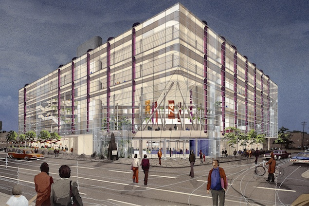
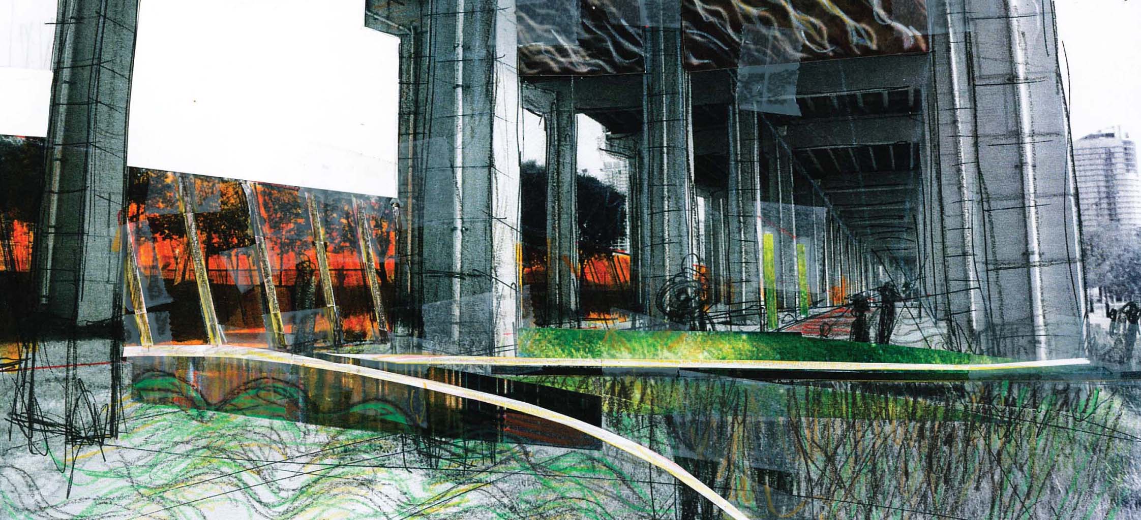
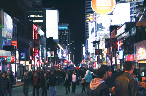
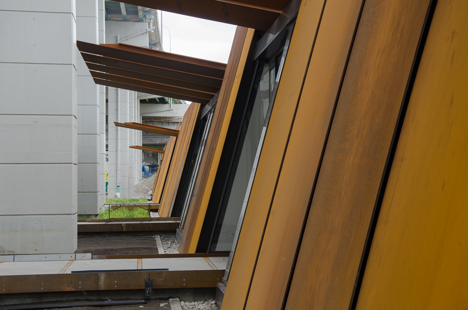
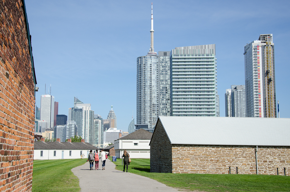
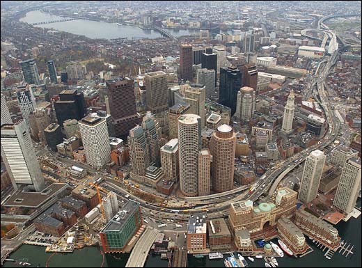
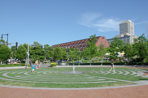
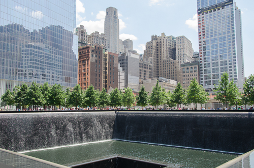
A takeaway from past Olympic Games’ host cities that spent big in a short burst of activity for the temporary event is a prescient reminder of the potential that well integrated planning for long-term transit and urban regeneration can bring. Toronto now has that same rare opportunity: the city is hosting the 2015 Pan Am/Parapan Am Olympics next summer. While it is relying on mainly existing infrastructure throughout southern Ontario for the sporting venues, an entirely new development is being built just east of downtown to house the 10,000 athletes and officials. 
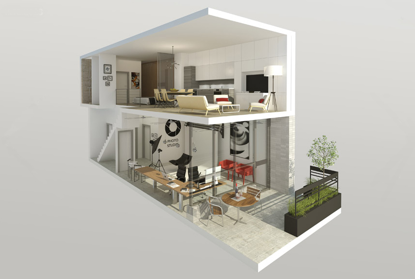
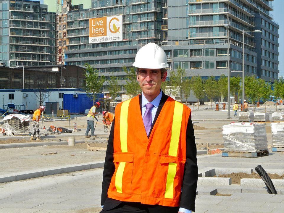
I recently met with Kenneth Tanenbaum, Vice Chairman of the Kilmer Group to discuss the Athletes’ Village. Revitalization plans will transform the former industrial site into a mixed-use community with affordable housing, condominiums, a YMCA and a dormitory for George Brown College students, branded post-Games as ‘Canary District’.

A version of this post appeared in the June 30th edition of UrbanToronto.    

Site plan of 2015 PanAm/Parapan Games Athletes’ Village (Canary District)

Tell us how it is that Toronto is about to get a new Athletes' Village and then a new neighbourhood in this former industrial area at the mouth of the Don River.

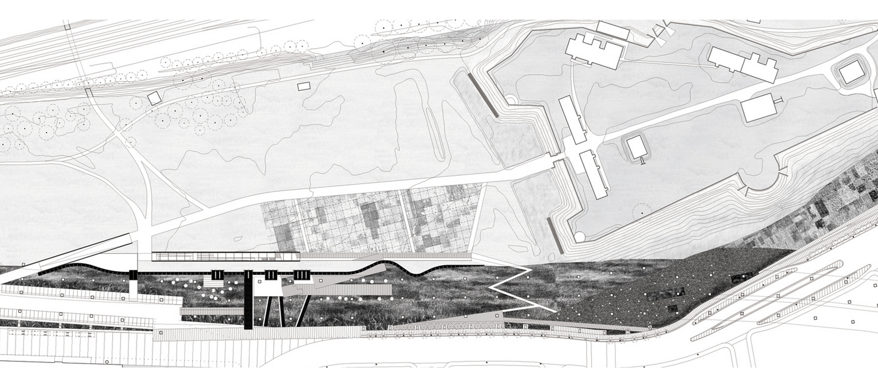
The genesis of the West Don Lands Pan Am Athletes Village and Canary District really begins with the government of David Peterson in the mid-1980s, which expropriated this land in the Downtown East with a view to allowing the city to grow in this direction. The market and environmental conditions of the site were such that the land sat derelict more or less for 25 years until a moment in time when forces converged with the Pan Am Games being announced, and Waterfront Toronto’s planning mandate was able to finally execute the vision that Peterson’s government had.

How did Dundee and Kilmer collaborate towards this proposal?

Kilmer has been in the heavy civil construction and materials business for three generations. I represent the third generation. I grew up in asphalt paving and aggregates and shifted towards engaging in public/private partnerships. Our firm, Kilmer Van Nostrand, has developed an expertise and set of core competencies in this area. We are not traditional real estate developers. Dundee, on the other hand, brings very deep experience in traditional real estate development. It was a very complimentary set of skills that brought us together and it was through that partnership that we’ve been recruited as the project delivery team.

We are very lucky because all the stakeholders are aligned to a single mission: deliver on time, on budget design excellence.

Kenneth Tanenbaum on the Canary District construction site, home to the Toronto 2015 Pan Am Athletes' Village

Big games bids run over budget in general. The demonstrations in Brazil are a current example. Given the background of cost overruns, what are your thoughts on best practices in cost management?

Infrastructure Ontario set up a procurement process that allocated risk properly between the public sector and the private sector. We worked with EllisDon and Ledcor to achieve a GMP or ‘guaranteed max price’ and there is significant skin in the game for those contractors if they are not delivering. DundeeKilmer’s objective is to make sure the team is marching together. Lots of tried-and-true building technologies were used here. We weren’t pioneers in anything.

What lessons have you taken from the 2012 London Olympics or 2010 Vancouver Olympics or other regeneration projects around the world?

Lessons were learned by spending time in Vancouver and interviewing people engaged in project delivery. Infrastructure Ontario, the procurement agency for the province, internalized those lessons and delivered a procurement model that I think set us up for success and which I believe represents a great export opportunity for other cities building Athletes’ Villages. It was an enormous undertaking to design, procure and finance a billion dollars’ worth of work in 90 days, which was the task we were given to do. We brought together a great team of designers, engineers, and contractors to do that.

Hundreds of lessons were learned from jurisdictions that didn’t have the right balance between private risk and public risk. What risks rightfully belong with the private sector? What risks should government continue to take? To Infrastructure Ontario’s credit, they came up with the right balance. I think Waterfront Toronto, insofar as planning was concerned, gave us a canvas on which to paint our architects’ view of the village. That was another important foundational piece for success – the precinct planning by Waterfront Toronto.

One of the areas where Vancouver where got off the rails is they were innovating in green building design. That’s all well and good and there are lots of green elements in our design as well but, when you have to spend $1M a day, everyday, you can’t be innovating or learning on a job site like this. You have to incorporate LEED best practices that are off-the-shelf. The right allocation of risk and the right team gets us to the right results.

The Pan Am Games is the largest event that this city has hosted and will host for a long time. It is a great opportunity for us to celebrate the great things about Toronto – a multicultural, pluralistic society, and a beacon on the planet. We have to tell a great story for Toronto. The Athletes’ Village is just one small element. It is part of the success story but it is not the story. The story is that we have 10,000 athletes and officials coming with their families from 41 countries who may at some point look at Toronto as a place to live, or invest but in the meantime they will be here spending dollars and going to restaurants.

Looking west on Front Street from Canary District to Downtown Toronto

Are you involved in creating any sports facilities?

No. Dundee Kilmer has only one mandate: to deliver the Athletes’ Village, on time and on budget.

Pan Am does not only exist in the Canary District. There are many other areas. How do they connect up? Is there a master plan?

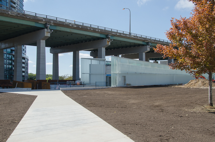
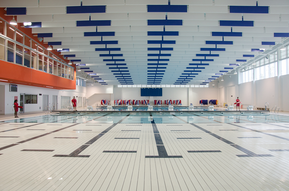
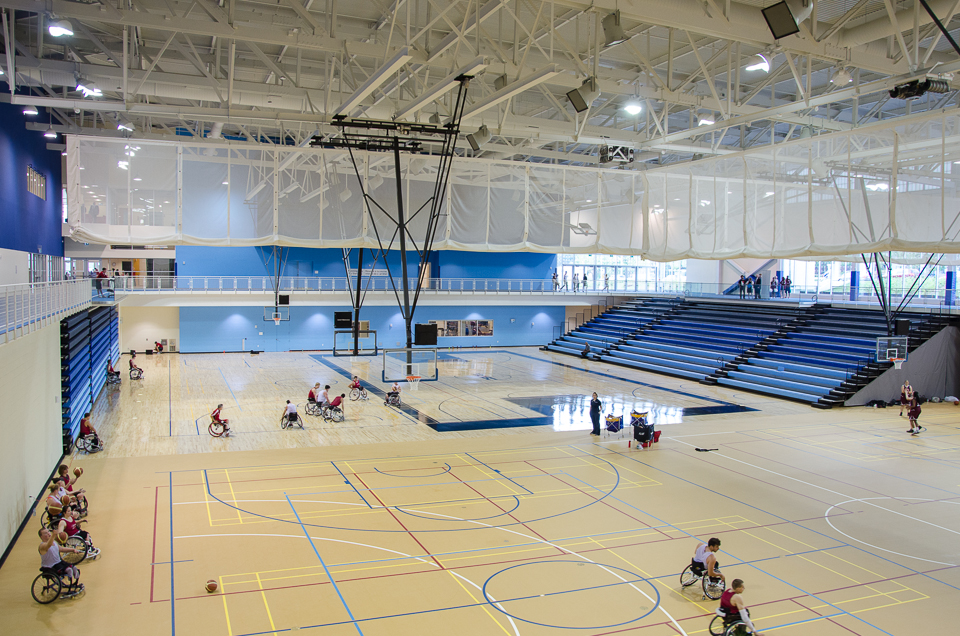
We are building something called the Transportation Centre south of Mill Street, on provincially owned land. It will be effectively part of the secured perimetre where buses will come in and out to move athletes from the Village to their games venues. The strategy of TO2015 was to have the Games be hosted by Southern Ontario so the venues are dispersed in Welland, Milton, Durham Region, Scarborough, and York University. That also enhances their legacy. All the sporting venues that are being used will have a post-Games life. Again, it is a lesson learned from other Olympic or multi-sport games where you have elements that become white elephants. You won’t have that here.

You’ve established some of the criteria for success. How will you know you’ve been successful?

I’ll know if the athletes aren’t sleeping in my basement! In all seriousness, success is an on-time, on-budget delivery of an Athletes’ Village in accordance with the IOC/Pan Am Games specifications. But, to me, the most important measure of success is in realizing a once in a lifetime opportunity to be a part of shaping Toronto’s next great neighbourhood.

Looking east from Canary District, Foundry building to the left.

What is there that exists already that drives momentum for that? Is it managing the overspill pressure from Downtown Toronto?

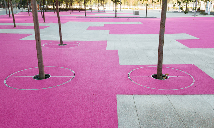
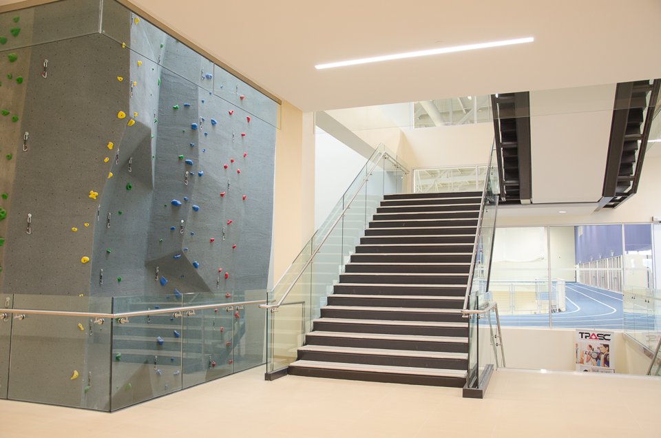
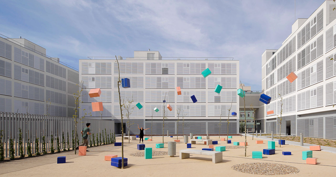
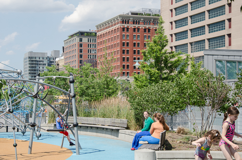
I think Toronto’s future really pivots on its ability to continue to attract 100,000+ migrants a year. How do we do that in an environment that is governed by provincial policy, Smart Growth, and Places to Grow (focused on intensifying the urban core), and do it in a way that does not lead to more traffic congestion and less liveable neighbourhoods? I think that Canary District really fits the bill in terms of Smart Growth: it integrates walkability, liveability, and transit. I think of the acronym HOME – housing, opportunity (jobs), medical care and education. A number of those elements are being built, or being planned. The YMCA will be an incredible amenity for this neighbourhood in addition to the public realm that really serves as outdoor therapy, which is vital for a healthy city.

You have chosen Canary District as the post-Games residential brand for the area.

The name ‘Canary’ comes from a restaurant at the gateway to this site. The heritage building (which we are restoring) had a bit of a chequered past. It was a school, then a brothel, and then a greasy spoon called Canary Restaurant that was famous for filmmakers and truckers who would stop in this area.

Existing brick buildings at gateway to the site to be restored.

How will the buildings be repurposed after the Games, as condos and apartments?

Immediately after the Parapan Am Games end in August 2015, the Village is turned back to us and we have the task of taking out temporary dividing walls, painting, putting in the hardwood floors and the kitchens – essentially making the units new again.

The biggest challenge from a post-games constructability standpoint is you don’t have the man and material hoists on the outside of the building so you have to preload and use the elevators as much as possible and optimize material in and waste out. There is a lot of planning going into it; in fact, logistics is the most complicated part.

Rendering of Athletes' Village/Canary District. Image courtesy of architectsAlliance.

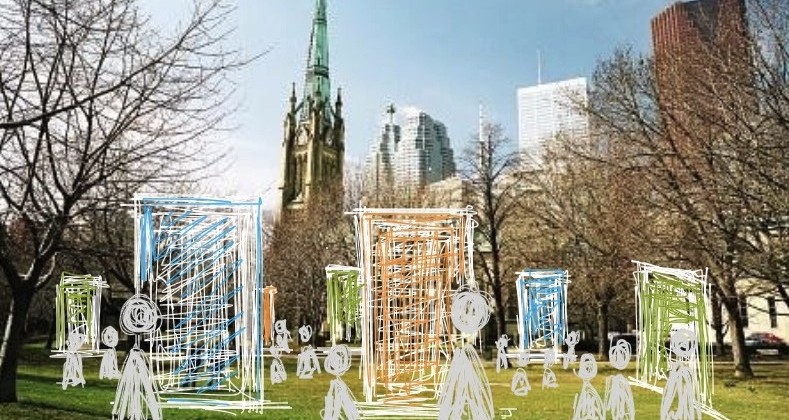
This area is considered the largest urban village in the city’s history. How will it be different than another major urban revitalization in Toronto, that of Liberty Village?

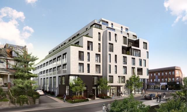
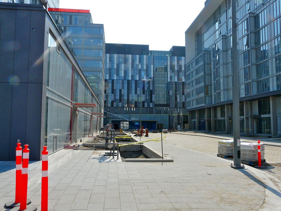
This was a very long time in the making. It reflects the thoughtful nature of Waterfront Toronto in terms of community and urban planning, and brings in Jane Jacobs’ principles of liveability and density. You won’t have canyons of glass towers here. It will be a much more liveable environment with the ‘eyes on the street’ concept.

So, in terms of differentiators, first it is the historical/planning context. The genesis is different in Downtown East than Liberty Village in that it involves much more master planning and more heritage elements, being adjacent to the Distillery District, and incorporating the brick buildings at the Cherry Street gateway to this site.

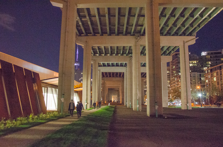
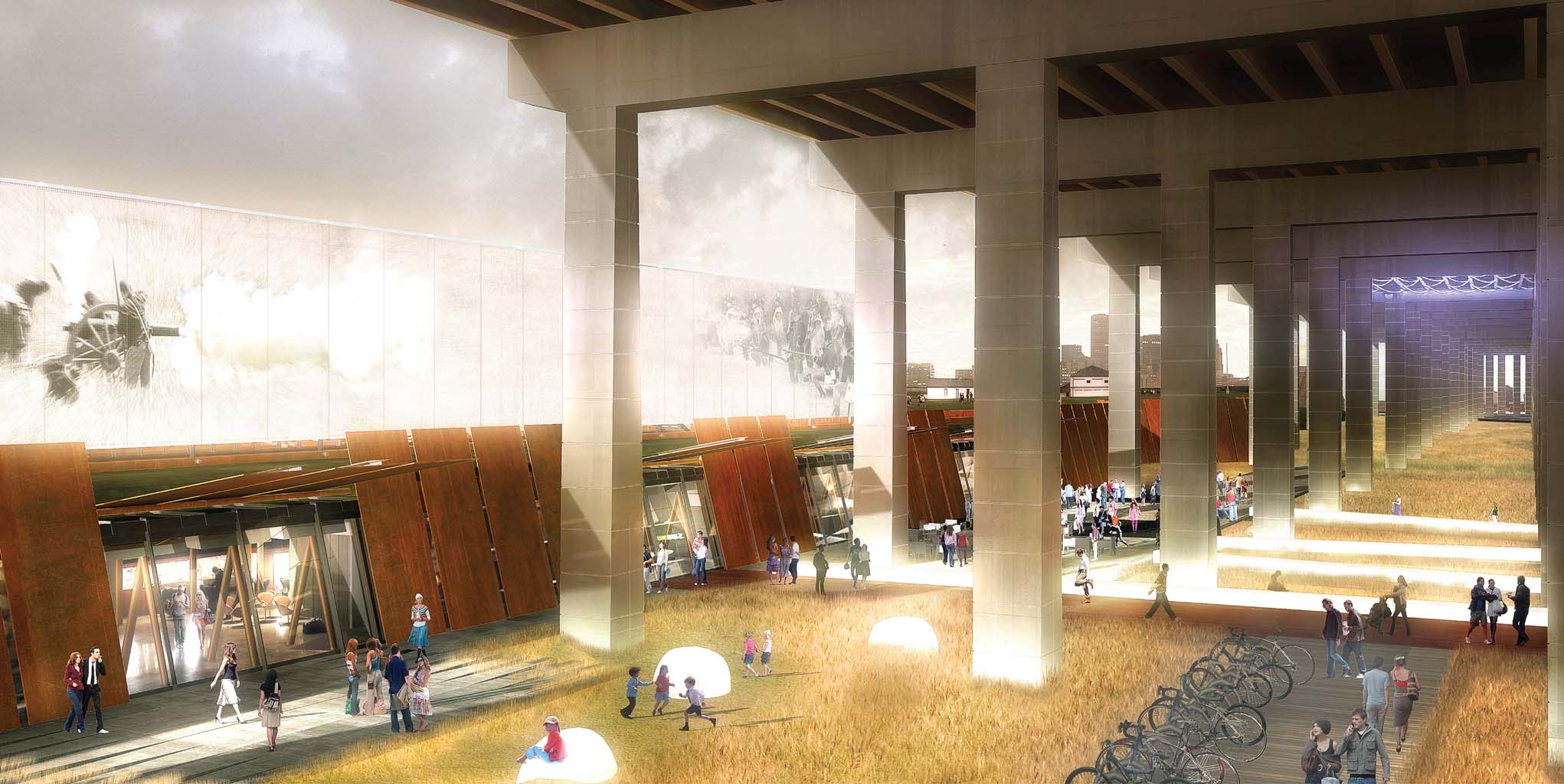
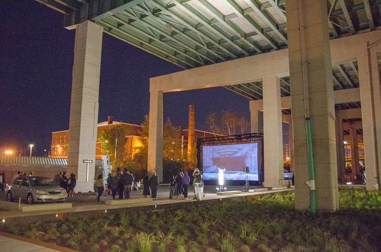
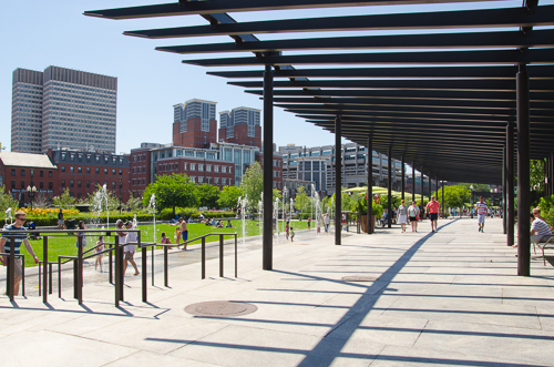
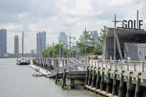
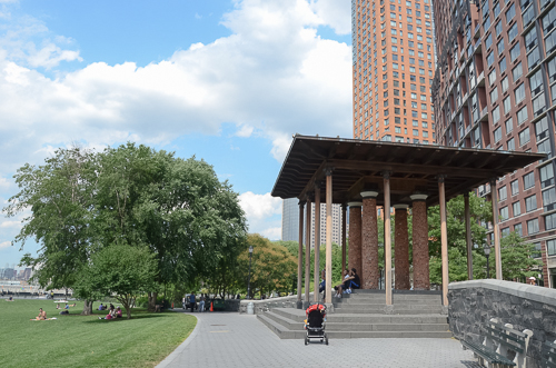
Further, I think the province made a very significant investment in the pubic realm, with the 18-acre Corktown Common park, the linear park (along the Front Street spine through the village), and Underpass Park. A brand new tunnel called the Bala Underpass will allow residents to enter Corktown Common without crossing a road and end up on the Don River Trail system and be able to bike to Edwards Gardens, to Sunnybrook. It is not an 18-acre park you’re adjacent to, but more like an 1800-acre park—through what is Toronto’s greatest natural asset, the ravines—and what many Torontonians don’t really get to appreciate because it’s very difficult to access.

The third differentiator from Liberty Village is the proximity to Downtown. We don’t think about Spadina being equidistant from Yonge as Cherry Street is. Torontonians’ view of Downtown is tilted to the west, and what we see is the Village/Canary District beginning to tilt back to a bit more equilibrium. What we are seeing in real time is just a beautiful evolution happening along those Front Street and King Street corridors.

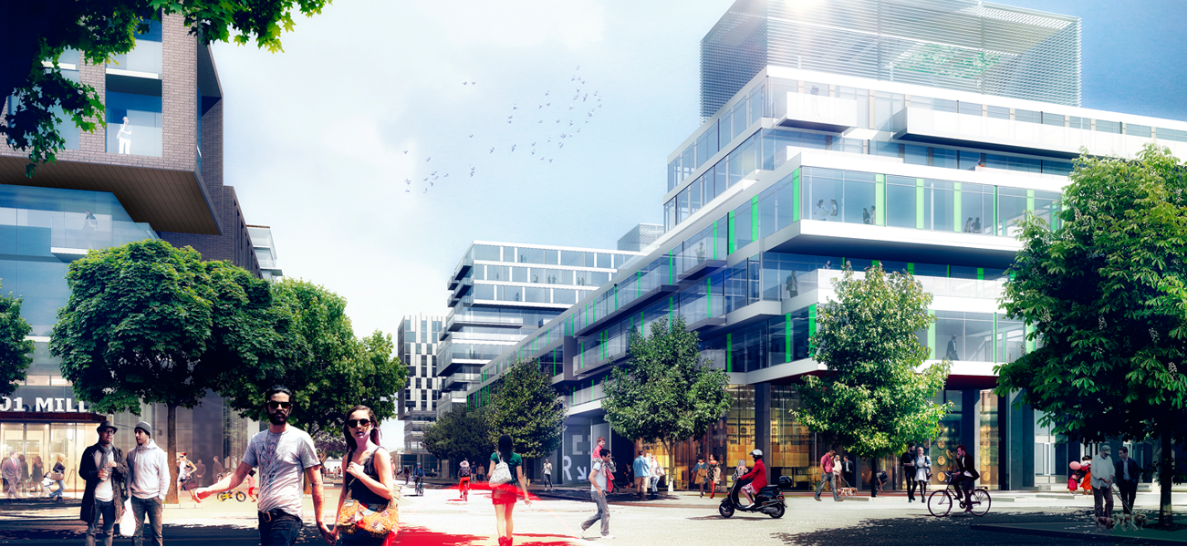
The fourth and final differentiator is the design aesthetic. In addition to public realm piece, what we DundeeKilmer aspire to is the absolute highest level of design excellence. So we brought a team onboard headed by architects Bruce Kuwabara of KPMB and Peter Clewes of architectsAlliance and they in turn recruited a team to create what they called ‘cohesive diversity.’

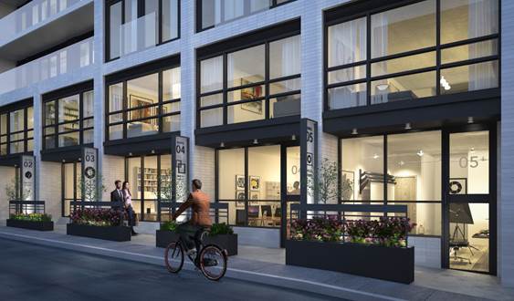
One element that really excites me is the porous nature of the neighbourhood. The designers were very deliberate in terms of opening the development blocks up to people migrating through them. So, there are laneways that pass through the blocks which is a really nice way to animate the space rather than forcing people to do right angles and walk around buildings, as you have in conventional block development.

Looking east on Canary District site. George Brown College student residence building in the distance.

Does Canary District become an appendage to Downtown or does it co-habit with Downtown with its own identity?

There are no physical barriers to here (e.g. river, expressway) from Downtown. It should become a natural extension of Downtown with a narrative that is very connected to the Don River and Martin Goodman trails. People talk about what makes for a great neighbourhood and I think it’s about diversity of interests, cultures, and economics. And it’s what makes a city great, it’s natural diversity, it’s the ability to transform, invent, and change. The unique challenge here was to deliver an entire neighbourhood and have it feel like a neighbourhood. A lot of thought went into the design, the programming, the unit mix in buildings (1, 2, and 3 bedroom suites), the type of retail and how it’s programmed to have a health and wellness theme that’s complimentary to the Distillery's retail programming.

The masterplan of the community was generated by architects, planners, and Waterfront Toronto. How was LiveWorkLearnPlay engaged here? They have created many villages and recreational places for Intrawest, with precedents like Blue Mountain and Whistler. But that is not the same as a year-round real liveable place?

I think of it as Waterfront Toronto providing the frame and the canvas on which to paint. They defined certain elements for our architectural team to conform to.

LiveWorkLearnPlay is our retail consultant, retail programmers so-to-speak. It’s not in their mandate to shape the urban fabric. They have the task of running a process to populate the retail opportunities within the Canary District under a general theme of health and wellness. Their mandate doesn’t extend beyond essentially animating the storefronts.

What we’ve relied on LiveWorkLearnPlay for is their expertise in creating the balance of a Village and the task of figuring out the right mix between restaurants, retail, and services.

Stephanie Calvet is an architect and a writer specializing in architecture and design. She can be found at www.stephaniecalvet.com

Live-Work Units by stephanie calvet

(this is an article I wrote for UrbanToronto) From a historical perspective, there is nothing groundbreaking about the live-work model. People have been living and working under one roof for centuries; think shopkeepers with their dwellings upstairs. Artists have built on that paradigm, transforming warehouses to accommodate the amenities of a home as well as open studio space to create and store finished artwork securely.

While commercial loft space – retrofitted with the necessary utilities – has always been a hot commodity amongst the creative community, the advent of live-work space has made the concept of living close to one’s work even more appealing, and – as developers realize – marketable.

This trend seems to fit well with our changing economy. With the recession many have shifted to self-employment, but more than that, the norms have changed. The stable, sequential career paths of a few decades ago are far less common, and a growing number of people work from home, facilitated by technology and online connectivity. Although many live-work spaces are marketed specifically towards retaining local, professional artists, the set-up gives greater opportunity to entrepreneurial residents. It describes a new take on an old idea.

Interior Rendering

There are a number of facilities designed and built especially with a live-work purpose in Toronto’s building stock. One of the newest is DUKE, a mid-rise residential development by Quadrangle Architects for TAS in the retro Junction neighbourhood. The seven-storey structure will add 109 condos to the area, including five live-work units aimed at creative entrepreneurs.

Street view of live-work units at DUKE Condos. Rendering courtesy of TAS.


Southeast corner of DUKE Condo, designed by Quadrangle Architects for TAS.


While the building will turn its most animated face to Dundas Street West, featuring a mix of high-ceilinged retail shops at grade, located along the quiet laneway to the rear of the building, with south facing frontage, will be the 2-storey live-work units.

These suites are well suited to artists, designers, small business and anyone who needs a distinctive work address, with living quarters above.

With direct access from the street, their lower level is designed such that the front can serve as a showroom or work area with a back section that has storage and a washroom.

Screen Shot 2014-05-06 at 9.22.23 AM


It is a reinvention of creative urban living where owners can conduct business during the day and return to their private quarters off-hours. The units are decently sized, averaging 1150sf with one model at 1548sf.  Each has a small patio at the front to provide a bit of privacy from the sidewalk.

image010


Also on offer are 2-storey townhomes nestled among the houses along Indian Grove – a more conventional living space for urban families.

Stephanie Calvet is an architect and a writer specializing in architecture and design. She can be found at www.stephaniecalvet.com

New Ryerson gallery has simple, dynamic design by stephanie calvet

A version of this post appeared in the April edition of  Canadian Facilities Management & Design Paul H. Cocker Architecture Gallery, Department of Architectural Science, Ryerson University. Photo by Shai Gil.

The new Paul H. Cocker Architecture Gallery Ryerson University in Toronto is a simple but dynamic design intervention.

Completed in October 2013 at a cost of $465,000, the renovated space within the Department of Architectural Science building adds a contemporary sensibility to the robust concrete interior of a dated facility. It not only enhances its functionality, but also gives it a more powerful presence.

Facing the building’s main entry, the gallery opens up the public space in a dramatic fashion. Its gleaming white envelope pushes into famed Canadian architect Ron Thom’s brutalist atrium, sharply contrasting its heavy concrete structure. Red felt wraps the entrance’s exaggerated frame to create a “ceremonial threshold”, while oversized glass pivot doors have the potential for various configurations. Unbounded by the space, white floor tiles visually extend the gallery limits and spill out into the atrium, their surface flush with the quarry tiles.

Ryerson’s Department of Architectural Science had previously lacked a secure, formal gallery. The school put out the call for proposals for the design of a flexible, multipurpose space within its existing facilities. Gow Hastings Architects (GHA) was awarded the project, allowing the local firm to build on its previously completed works at the school, including office renovations, grad labs and a bold red branding exercise.

GHA was drawn by the challenge to find potential within the existing structure, says principal Valerie Gow, who likens renovations to “opening a can of worms.”

As with most projects, this one wasn’t without its unique challenges. The gallery project inadvertently coincided with a total building HVAC upgrade. Fortunately, it happened early enough in the design stage that the designers could make the necessary mechanical changes and co-ordinate all services to fit above the established datum line without compromising the ceiling plane.

Splayed pivot doors at Paul H. Cocker Architecture Gallery, Department of Architectural Science, Ryerson University, Toronto. Photo by John Howarth.

Before the building’s transformation, visitors faced a blank wall clad in particleboard, which concealed storage. By reconfiguring the first floor interior layout and relocating the storage area, a small team of architects led by Gow carved out a rounded 3,120 square feet of bright white gallery space, distinct in character from the rest of the facility.

The perimeter wall is faceted to maximize the mountable flat display area. While this wall steals space from the graduate studio directly behind it, its gentle curve softens the intrusion. It is also covered with red felt, optimizing pin-up wall space for drawings and sketches.

Large but thin porcelain tiles, in accentuated lengths, radiate across the floor. A sticky film with a graphic in a non-slip texture can be applied to the tiles. In this way, the floor becomes another canvas for display, an application the architects had not anticipated.

To the immediate right of the gallery entry is a white feature wall listing university donor and sponsor dedications, fitted with a small bench. Its opposite side serves as a backdrop for students to showcase their digital fabrications.

Aside from marking the threshold, the felt wall covering has many practical uses, particularly where hard surfaces abound. It is tactile and tack-able, provides sound absorptive qualities and visually warms the space with colour.

The glazed wall between the first-floor studio and the atrium was set back in order to gain additional floor area, and pin-up space was achieved with a two-sided magnetic white board floating in the centre of the wall. It provides general privacy to the typically messy studio space beyond, while offering visitors glimpses into it.

With space to host critiques and travelling exhibits, and as a venue for the student body and faculty to display their work and research, the new gallery has become an extension of the three-storey lobby atrium, which is the primary gathering space for department-wide events and activities. Adjustable track lighting and a hanging metal framing system enable the gallery space to be completely reinterpreted with each new show.

Paul H. Cocker Architecture Gallery, Department of Architectural Science, Ryerson University, Toronto. Photo by John Howarth.

The gallery’s modest insertion is designed to reflect the institution’s collegial and collaborative spirit. In fact, GHA even engaged students in the project, assigning them the feature wall’s ever-changing exhibition and incorporating student-made display cubes into the gallery’s initial opening.

“I just love the energy of students,” Gow says. “Working together with them is lively and makes the design richer. It reminds me of being back in the school environment myself.”

Faculty members from other departments have expressed interest in using the space — an opportunity for the cross-pollination of ideas. While the gallery remains a successful interior intervention, there are discussions in the works of how its presence might be articulated on the building exterior.

Stephanie Calvet is a Toronto-based registered architect and a writer specializing in architecture and design. She has 11 years of experience working in architecture and planning firms in Boston, designing projects in the hospitality, multi-unit residential, education and healthcare sectors.

Totem Condos Stacks Up Well Against Average High-Rises by stephanie calvet

(this is an article I wrote for UrbanToronto) The poignant nature of the high-rise is to identify itself in the urban skyline. Toronto has developed a tall condominium vernacular of floor-to-ceiling glazing but if you ask many a Torontonian, the city is saturated with much of the same: the generic glass tower that does little to make a positive long-term contribution to the public realm.

Totem Condos is a new residential building downtown by Worsley Urban Partners in conjunction with local architectural practice RAW Design. The 18-storey structure will house 120 units as well as a three-level below-grade parking garage with slots for cars and bicycles. The building has a very compact footprint and uses its space to the maximum, with very little left to waste.

Totem Condos, Worsley Urban Partners, RAW Design

RAW continues the evolution of the local condominium architecture with a proposal that sets itself apart from the rest. The building was conceived as a series of glass and dark steel framed boxes, carefully stacked. The eye is drawn skyward as the building’s geometry gently shifts left and right. Small blue ‘fins’ on the south elevation provide some additional visual interest, reflecting light in unique ways, and, when viewed from the interior, creating angled sightlines. In contrast to the sleek surfaces, stone cladding at the base provides texture where the building meets grade.

Lower Manhattan’s award-winning New Museum, a showcase for contemporary art and an icon of urban modernism, inspired the design. Taking cues from the block forms in its surroundings, the Museum stacks seven anodized aluminum mesh-clad rectangular boxes one on top of the other. The shifting of the boxes as they ascend yields a variety of open, fluid, and light-filled internal spaces and gives the building its dramatic shape.

New Museum of Modern Art, Hisao Suzuki, SANAA

The design firm responsible for the branding and marketing of Totem is The Walsh Group – and it’s not your typical ad agency. Under the creative direction of Shakeel Walji, the firm had a strong hand in influencing the built form. “We consult, direct the architect or interior designers working in conjunction with the developer to see what kind of look we want to create. It’s more of a collaborative effort between all parties involved and we like it that way because we feel the product is better, and we feel confident in moving forward in selling.” This sharing of creative control is not always welcome and can rub some team members the wrong way.

But Walji is quick to praise the building’s bold design, saying, “This is a better reading of a point tower in the city compared to most.” He refers to what he finds are all too similar forms in the skyline as a direct result of the need to comply with either mid-rise or high-rise guidelines, which he claims, limit innovation. His criticism is cutting. “The architects spend a lot of time developing the podium on which the building sits, take a coffee break as the building rises, and then there’s a cap at the top. Totem doesn’t have that reading at all.”

Totem Condos, Worsley Urban Partners, RAW Design

Totem is located in ‘the village’ on Dundonald, a leafy street lined with 2- and 3-storey Victorian homes that retains much of its early 20th century appearance as a residential subdivision northeast of Yonge and Wellesley. The site is currently home to the Commercial Travellers’ Association of Canada Building. The 2½-storey structure, built in 1956, was included on the city’s inventory of heritage properties in 2010, acknowledging the cultural heritage value of its Modern design, popular in post-war Toronto. Highly representative of the style, it features a grid of solids and voids with turquoise-hued glazed brick, travertine, aluminum and concreted cladding; façades are organized into bays where concrete piers divide tiers of strip windows with travertine spandrels and panels.

It is separated from the street by a small landscaped courtyard. The original structure will become the base of Totem, adding context, history and texture to the building’s design. Although the prevailing character of Dundonald is composed of low-rise buildings that make up the balance of the streetscape, the scale jumps up: immediately to Totem’s west is the 24-storey brick-clad Continental Tower apartment building from the early ‘70s. Behind it is 22 Condominiums, a glazed 23-storey residential tower at 22 Wellesley St. East by Peter Clewes of architectsAlliance.

Existing building on site of 17 Dundonald Street: Commercial Travelers Association of Canada Building

Although City Council has since overturned the office building’s heritage designation, large elements of its modernist façades will be retained and will inform the overall design of the development. Integrated into Totem’s base, the original building will be dismantled and re-built, while above, offset floor plates will cantilever at various levels.

“The City, the TTC (which owns adjacent land), the planners and councillor were very interested to see how we could make this building happen, how we could have a piece of architecture that we could all be proud of,” says Walji. “Our city needs more of this. We should keep elevating the things we offer.”

“When we have architects that develop buildings that are of some stature, that adds to the visual language of our cityscape. It will be more inviting, more tantalizing. NYC is a great example—every corner is like a little gem—it’s memorable.”

Totem Condos, Worsley Urban Partners, RAW Design

Building form aside, the amenities are pretty swish and, “above and beyond your basics,” notes Walji. The second level will house a gym, a private dining room, and a lounge/bar that opens onto a small exterior space for dining and BBQ.

A roof deck tops the tower and its programming provides the access to outdoors where the building’s mainly small recessed balconies fall short. Residents can enjoy a dining area and lounge with a fire pit and panoramic city views.

The building has a Walk Score of 100 and a large appeal of the location is the access to the Wellesley TTC station. Its street entrance is set in one of the four bays on the north façade, where the building's main entry was previously situated, under a protective angled canopy. Totem residents can walk through a secured passageway from the main floor lobby directly into the subway station. “This was the biggest selling feature used to entice brokers to investors and buyers”, says Walji “and it’s the first building in Toronto to have it.”

Totem Condos, Worsley Urban Partners, RAW Design

Stephanie Calvet is an architect and architectural writer based in Toronto. She can be found at www.stephaniecalvet.com

Mario Ribeiro of Triumph talks Howard Park Residences by stephanie calvet

(this is an interview I did and article I wrote for UrbanToronto) UrbanToronto’s Stephanie Calvet sat down with C.E.O. Mario Ribeiro of Triumph Developments to talk about Howard Park Residences, an urban infill project at the intersection of Dundas and Howard Park in Toronto's Roncesvalles neighbourhood. The first phase, an 8-storey building (far right)   is under construction. Now the company is bringing its Phase Two western counterpart to the market. They will be joined by a multi-storey linking element, with the common entry and courtyard located between the two.

Looking north towards Howard Park Residences, Phases 1 & 2, image courtesy of Triumph Developments

7401374654_72c472c3d2_b

The site, with its odd triangular geometry, was previously home to a service station, aging garages and warehouses (see above). Removing these former industrial activities is an opportunity to tie eclectic Dundas and Roncesvalles Avenues, and to rethink the site as an active part of the public flow with a typology that combines high build density with a commercial program.

RAW Design, a local architecture firm with a portfolio of innovative mid-rise infill projects, crafted the buildings to the site and low-rise residential surroundings, breaking down the scale through massing and detailing. Vegetation that grows on each of its stepped metal terraces at the top floors imparts a softness to the elevation, inextricably part of the ‘look’ of the building that Triumph is committed to providing.

Linking element between Phase 1 (right) and 2 (left), image courtesy of Triumph Developments

The project required an amendment to the existing zoning by-law to convert it from industrial to residential and mixed use. How has the project been received by the community?

It was well received. We've had no community pushback and lots of support from planners and the councillor. The community asked if commercial space was possible and we integrated that idea into the design.

What sorts of establishments would you like to see occupying the first floor retail/commercial spaces?

We are not looking for large franchises. This is a trendy neighbourhood. We are subdividing the space and hoping to get a variety of small shops, a daycare, maybe a bookstore…

There is more than the typical mix of unit types here. Who is your intended end-user? Is there anything larger than a 2-bedroom plus den?

We have a vast array of styles catered to a lot of different tastes: units tailored to the young professional, units with patios, units for families, including 3- and 4-bedrooms... Our biggest unit is 1400sf. We also have five 2-storey townhomes.

Looking west towards Phase 2 at Howard Park Residences, image courtesy of Triumph Developments


What building amenity program did your team develop that, from your standpoint, is in line with what residents want and need, practically speaking?

Because of the nature of the neighbourhood, there are lots of local amenities within walking distance. To keep construction costs and condo fees down, we provide typical meeting rooms, lounge, a media room, and gym but no pool.

The base building is charcoal-coloured brick and glass and then at the 6th floor, there is a shift both in plan and in exterior cladding. What material is used for the remaining storeys?

It is metal cladding and it goes with the window system. It is also perforated to allow plants to grab onto it.

Incorporating vegetation on the façade will give the building a very interesting presence on the street and from afar. This amount of 'building green' is unprecedented in Toronto...

The cascading vines, green roofs and planters will be maintained by the Condo Board as part of the 'common area’, and not up to each individual owner to maintain. That will keep it looking uniform. There is no stormwater tank but water will be dealt with on site through a combination of stormwater management solutions.

Relative locations of Howard Park and Roncesvalles Lofts by Triumph Developments

The site has access to transit (streetcar, subway, one of the stops of the new Union Pearson Express), lots of grade-level bike storage and a great Walk Score. What is the buildings’ parking ratio? Any provision for electrical vehicles?

The parking ratio is around 65-70% suites to parking stalls. At the moment, we’re seeing only 1 out of every 2 units asking for parking and the explanation is that the building is so well serviced by transit. On the other hand, bicycle spots are aplenty and they are in big demand. As for electrical vehicles, that is not final yet. In Phase 2, we provide storage lockers on the upper levels – so that residents have a locker almost across the hall. It became possible because we had to be creative in utilizing the oddly shaped resultant spaces in the core so we located storage lockers and services there.

It is great that parking and service access will be situated along the shared laneway off Howard Park Ave, making the lengthy (650') Howard streetfront more pedestrian-friendly and accessible for building, townhome and retail entries. Was it a challenge to locate it behind the building?

It might have been easier to situate it between the two buildings but it would have destroyed the look of the complex, and we didn’t want to interrupt the sidewalk. This way it’s off the laneway into Phase 1 and the parking garage under both buildings is all connected.

The building integrates many green initiatives: infill site, brownfield, green roofs, geothermal, stormwater, bike storage, etc. Are you going to take it through the LEED certification process?

Not LEED, although the plaque would look great on the wall! I’ve gone through the process as a trade on other projects and it is painstaking and very difficult administrating all the paperwork. We will comply with Toronto Green Standard Tier 2.

Looking west towards Phase 2 at Howard Park Residences, image courtesy of Triumph Developments

Incorporating geothermal systems (for heating and cooling) in condo building is not common practice in Toronto but the City gives government rebates and interest-free loans to help residential developers ‘go green’. Would you have incorporated it anyways because of the policy of your company or were government financial incentives necessary to make it reach the ROI you were expecting?

We didn’t get any government incentives. We started the process 3 years ago. Geothermal made economic sense in the long term because, if well implemented, it will save on the operation of the building.

Triumph has a keen focus on advancing and promoting sustainability, much like developers like TAS, Minto, and Tridel claim. Any market difference between them and yourselves?

Our scale of projects is smaller. The green initiatives on our buildings are maybe not as cost effective at this scale as Minto would do it. But we’re doing it because it’s the right thing to do – that’s the initial motivation – not for marketability reasons.

You have a European background. What aspects of European planning and design would you like to see inform building in Toronto?

Families living in mid-rise buildings is very common in Europe and we don’t see it as much here but I think there is a demand and a trend moving in that direction. I’d like to see buildings inserted into established neighbourhoods so families have access to amenities for their day-to-day, where they can can live and work close by, and people may even be able to go home for lunch. Large courtyard features, shared backyards, schools within walking distance, and several generations living in the same building – these are intimate living examples that I was familiar with. There is a sense of family and unity. We had these ideas in mind for our first project, Roncesvalles Lofts, and they continue to be valid for Howard Park. It is not a 25-storey structure; this is a place that makes sense to have an 8-storey building. It is a ‘community’ where you get to know your neighbours. The project will house 96 units – not a huge amount of people – and it is not intended to be transient with mainly short term rentals. Hopefully people move here and stay for a lifetime.

Stephanie Calvet is an architect and architectural writer based in Toronto. She can be found at www.stephaniecalvet.com