Quadrangle Architects

Creative Thinking Adapts a King West Commercial Building by stephanie calvet

A version of this post appeared in the August 12th edition of UrbanToronto Another adaptive reuse project has won out in Downtown Toronto. The modest building at 545 King Street West is being rehabilitated by Hullmark and will see new restaurants and offices occupy its five floors. It is a refreshing change from the tactics of some developers who, keen to maximize real estate values, can succumb to demolishing the historic fabric of the neighbourhood rather than considering the role adaptive reuse can play in the city.

The street has radically transformed in the past decade. Its potential was unleashed back in the mid-90s when changes to zoning allowed King-Spadina (one of the “Two Kings” reinvestment areas), once-restricted to industrial, to open up to new uses. Since then, King Street W has been flooded with award-winning restaurants, corporate headquarters, nightclubs and condo buildings. The spin-off effect since the planning policy was introduced has seen this creatively oriented and vibrant part of the city emerge as a highly desirable urban lifestyle community.

Sketch of proposed exterior graphics at 545 King St W, image courtesy of Quadrangle Architects

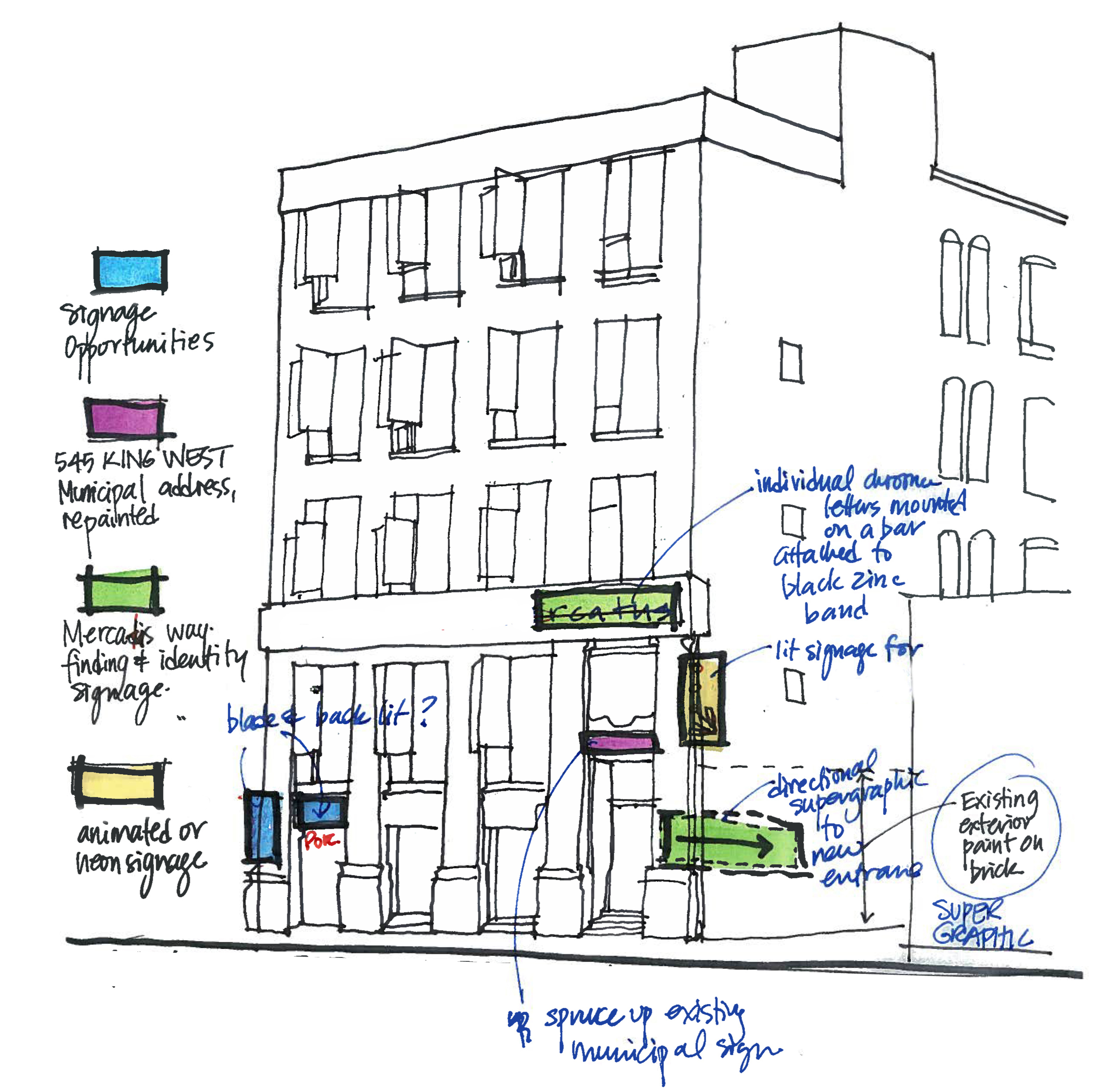
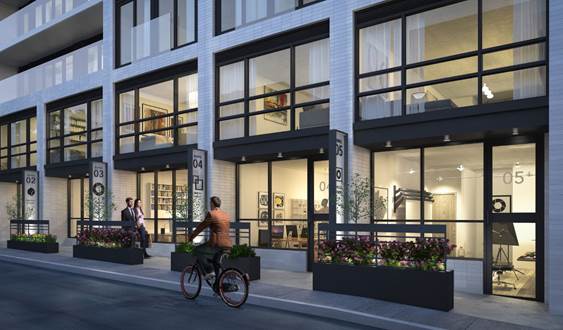
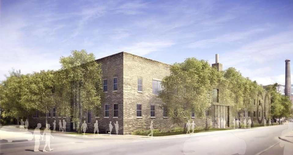
Originally built in 1921, with a rear addition completed in 1981, 545 King Street W is characterized by brick and heavy timber beam construction, once commonly found in the former Garment District. No drastic changes were made to the exterior in the Quadrangle Architects-led renovation. It is constituted of an updated façade treatment with new windows and sills, cleaned and repaired brickwork and the addition of graphics and material accents. Because of the building’s narrow proportions and the existence of windows on its side elevations, the designers were inspired to build on the idea of natural ventilation. Casements replace existing glazing, with coloured fritted glass emphasizing their operable function and animating the façades. “Our intention was a subtle augmentation of the building while maintaining the existing character to add a new layer of contemporary expression,” says Richard Witt, a principal at Quadrangle.

Existing building at 545 King St W, photo courtesy of Hullmark

Rendering of updated north elevation at 545 King St W, image courtesy of Hullmark

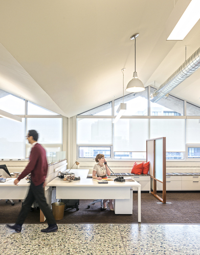
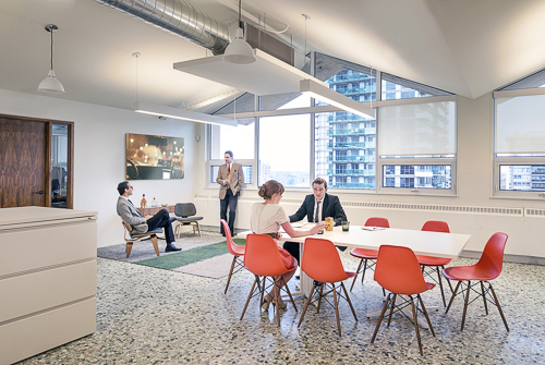
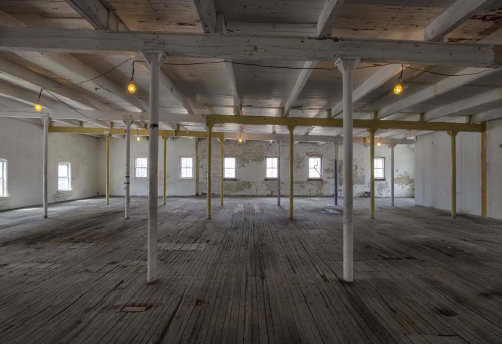
The interiors, however, are getting a major facelift. The building was stripped back to its exterior walls and bare floors and ceilings, which presented the architects with the opportunity to completely reinvent its spaces. Popular restaurants Pizzeria Libretto and Porchetta & Co. will open up secondary locations on the lower level, and a software company is to set up shop on the 5th. BrightLane, a co-working space for entrepreneurs and start-ups, will continue to occupy the remaining levels and its members have access to the 3rd floor roof terrace. The top floor has a 2-storey volume office space capped with a skylight.

Gutting of typical floor at 545 King St W, photo courtesy of Quadrangle Architects

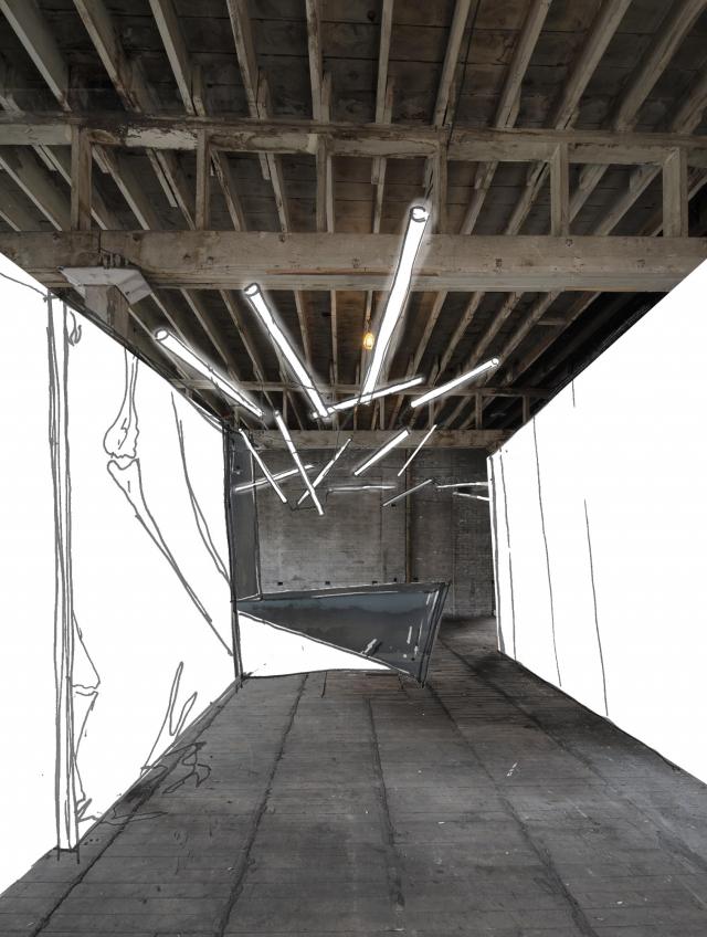
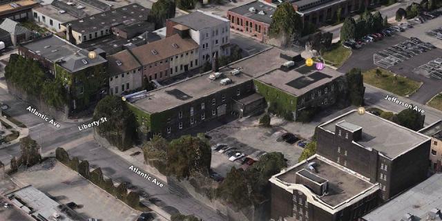
A particularly interesting angle to the project is the revitalization of the dreary 153’ long by 12’ wide laneway immediately adjacent. It previously served a warehouse loading dock at the rear that the architects have transformed into the main commercial entrance and new ‘front door’. (The building’s existing ‘front door’ on King Street W becomes a convenience entrance for the upper levels.) The flanking laneway, once dedicated to deliveries, is converted to a pedestrian area with a restaurant patio and spill-out space from the new lobby.

Existing alleyway adjacent to 545 King St W, photo courtesy of Quadrangle Architects

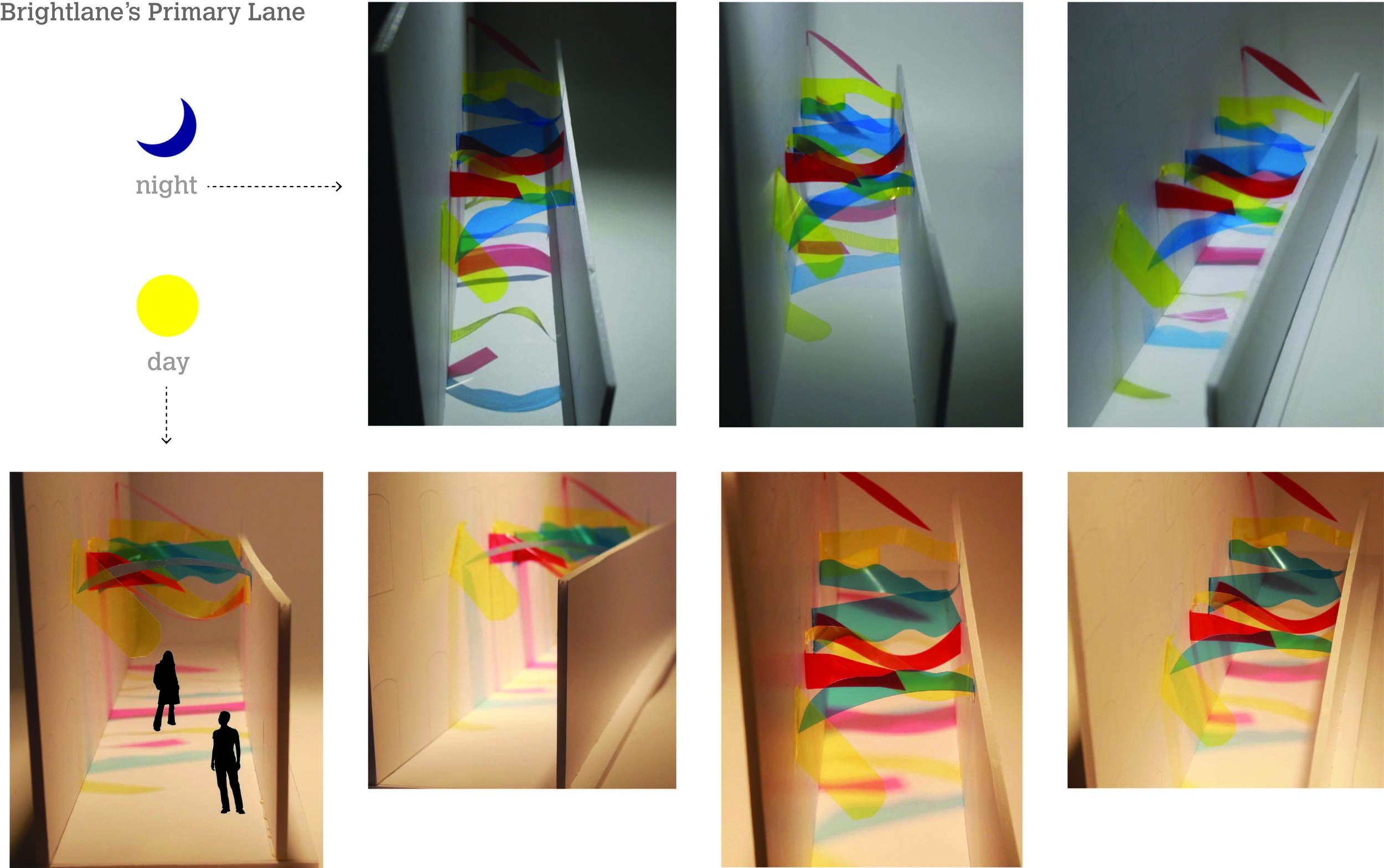
BrightLane, the building’s primary tenant, hosted an ideas competition seeking inspiration from the public for ways to make the narrow, marginal space more appealing. “We’re looking for something interesting and sustainable that can be easily implemented,” said its General Manager, Susy Renzi. The call for submissions was made via video headlined 'Can you make this sad space AWESOME?' It drew over 180 entries from local and international creatives, whose ideas ran the gamut from forest oasis, outdoor market, and playgrounds for adults (with and without a giant waterslide).

The winning scheme proposes to brighten the space by suspending fragments of primary-coloured acrylic in wavy shapes above it. As the sun travels over the lane, coloured moving shadows are cast onto surrounding surfaces; the experience being equally evocative at nighttime, when illuminated by floodlights. The canopy of colour represents the energy and interdisciplinary environment that BrightLane fosters. The simple but dynamic concepts applied to the façades and laneway provide better visual connection into the building and extend the street life.

The winning submission from Brightlane's ideas competition will be implemented in Spring 2015

The difficulties associated with adaptive reuse can be a deterrent to many developers. Unforeseen discoveries on site – from mould to hidden fuel tanks – can have negative impacts on cost and schedule and the added complexities often require creative solutions. Despite the challenges, the benefits are multi-fold. Rehabilitated and repurposed buildings not only help meet city-mandated density requirements, but they contribute to the fabric of city life and the continuity of collective memory.

With a long-time specialty in retrofit and adaptive reuse, Quadrangle brings agility and nimbleness when working with existing conditions. A synergy clearly exists between the developer and the architects – this is, after all, the third collaboration of similar objective between them. “Hullmark understands that buildings like this have value and that value is worth working hard to unlock”, says Witt. Under the direction of Jeff Hull, Hullmark’s vision as city builders, previously known for their large residential developments, has taken a more urban focus and set its sights on high quality inner-city tenants. By renovating and turning a former warehouse into a vibrant employment and amenity hub, the building both reflects its history and becomes relevant to the future of King W.

Other than the alleyway installation, the 545 King Street West project is scheduled for completion this summer.

Stephanie Calvet is an architect and a writer specializing in architecture and design. She can be found at www.stephaniecalvet.com

Turning a forgotten penthouse into office space by stephanie calvet

A version of this post appeared in the June edition of  Canadian Facilities Management & Design.  Park Property Management renovation by Quadrangle Architects. Photo by Bob Gundu

When rental company Park Property Management (PPM) required an additional office, it searched its apartment inventory. It unearthed 2,000 square feet perched atop a north Toronto building, 15 storeys up. Long forgotten, the penthouse had been relegated to a storage depot, stashed with cleaning supplies, gym equipment and the superintendent’s found treasures. PPM called on Quadrangle Architects’ Interiors Group to see if there was any hope for its rehabilitation and conversion to a workplace.

When the designers walked into the space, they immediately saw potential. With its concrete folded plate roof, open span, and enveloping daylight, it was evident that it had good bones. Unfortunately, it served as little more than a glorified broom closet. “This is wonderful!” stated principal and interiors group lead, Caroline Robbie. “How could (one) have been sitting on this for so long and not done anything with it?”

PPM_image2-4

Having outgrown its current digs, PPM needed to manage some 12 buildings from this location. The program was simple: two private offices, workstations for a small number of staff, file storage, a meeting area, a kitchen, and a space to greet visitors. PPM also wanted the flexibility to grow.

Completed in November 2013, the project didn’t involve a great deal of building; the space was mostly in desperate need of a clearing out and freshening up. Original inherited features including the terrazzo floor and radiators were retained, and the exposed concrete folded plate ceiling was stripped of random adhesive tiles and clad in drywall. Small storerooms were demolished and an updated HVAC system was installed. The biggest ticket item was the perimeter’s total window replacement, which in turn had a positive effect on light quality and energy efficiency.

The design direction for the interiors was borne of the building’s early 60s vintage and the space’s strong architectural language: align the interior design with the architecture by emphasizing its mid-century modern heritage. Walnut veneer is used in the millwork, extending to the furniture and accessory pieces, while accent details are co-ordinated in black or satin bronze finish, right down to the tiny tapered cabinet pulls.

The new Mad Men-inspired office blends commercial and residential; PPM, after all, is in the business of where people live. Just as building superintendents and managers come to the office to discuss operations, tenants come to sign leases or negotiate sublets. “We wanted to give it a warm, residential feel, but without seeming false, folksy or artificial,” Robbie said.

PPM_image-vert

Visitors step off the elevator into an intimate vestibule, only seven feet in height. A wiry carpet recalls an entrance mat and the painted black walls are adorned with an overlay of repeating company logos in gold leaf, simulating custom wallpaper. Period-correct wall sconces complement the residential aesthetic.

From there, the low ceiling gives way to reveal a light-filled and lofty open plan space peaking at 12 feet. Simple white lighting fixtures hang overhead. Underfoot, carpet tiles are grouped to resemble area rugs, picking up green, grey and brown tones of the terrazzo flooring.

The waiting area, more akin to a living room, is distinguished by a carefully curated collection of signature Eames pieces: lounge chair, coffee table and compact sofa. This classic design furniture by Herman Miller is mixed with a row of crisp white contemporary workstation systems tucked under the profiled ceiling, channeling a retro feel. “It resonates with a certain generation of people but it still looks modern. To me, modernism still looks fresh — it doesn’t look dated,” Robbie said.

Park Property Management_interior. Photo by Bob Gundu

Two private corner offices follow. The remaining open area has a meeting space with bright orange Eames shell chairs and banks of files. The area can easily be added to or reconfigured. A kitchen and powder room complete PPM’s new office.

File storage was a priority. Going paperless is a growing trend, with many workplaces now managing information electronically. But the rental industry, with its paper-based origins, is in a transitional phase. Leases are still penned and copies must remain on site as long as leases are active, amounting to loads of paper records. With that in mind, designers stacked some filing cabinets three high and turned them into work surfaces. They also arranged some filing cabinets singly, so the cabinets can double as upholstered benches. Kept low, they don’t create a wall, visually or practically. “We tried to do it in a way that the stuff didn’t get in the way of the people,” Robbie said.

Park Property Management renovation by Quadrangle Architects. Photo by Bob Gundu

And where they could refurbish, they did, often with a sense of whimsy. A 60s Sputnik chandelier was re-appropriated from another property, and a glitzy pinball machine reinvented by one of the company’s owners was placed upright as artwork.

The renewed interior not only makes more efficient use of the real estate, but it offers a highly functional and comfortable workplace where one had not been envisioned.

“A building’s lifespan has to grow and change over time,” Robbie said. “As a designer, you’re seeing its attributes and its potential where someone else might not.”

Stephanie Calvet is a Toronto-based registered architect and a writer specializing in architecture and design. She has 11 years’ experience working in architecture and planning firms in Boston, designing projects in the hospitality, multi-unit residential, education and healthcare sectors.

Live-Work Units by stephanie calvet

(this is an article I wrote for UrbanToronto) From a historical perspective, there is nothing groundbreaking about the live-work model. People have been living and working under one roof for centuries; think shopkeepers with their dwellings upstairs. Artists have built on that paradigm, transforming warehouses to accommodate the amenities of a home as well as open studio space to create and store finished artwork securely.

While commercial loft space – retrofitted with the necessary utilities – has always been a hot commodity amongst the creative community, the advent of live-work space has made the concept of living close to one’s work even more appealing, and – as developers realize – marketable.

This trend seems to fit well with our changing economy. With the recession many have shifted to self-employment, but more than that, the norms have changed. The stable, sequential career paths of a few decades ago are far less common, and a growing number of people work from home, facilitated by technology and online connectivity. Although many live-work spaces are marketed specifically towards retaining local, professional artists, the set-up gives greater opportunity to entrepreneurial residents. It describes a new take on an old idea.

Interior Rendering

There are a number of facilities designed and built especially with a live-work purpose in Toronto’s building stock. One of the newest is DUKE, a mid-rise residential development by Quadrangle Architects for TAS in the retro Junction neighbourhood. The seven-storey structure will add 109 condos to the area, including five live-work units aimed at creative entrepreneurs.

Street view of live-work units at DUKE Condos. Rendering courtesy of TAS.


Southeast corner of DUKE Condo, designed by Quadrangle Architects for TAS.


While the building will turn its most animated face to Dundas Street West, featuring a mix of high-ceilinged retail shops at grade, located along the quiet laneway to the rear of the building, with south facing frontage, will be the 2-storey live-work units.

These suites are well suited to artists, designers, small business and anyone who needs a distinctive work address, with living quarters above.

With direct access from the street, their lower level is designed such that the front can serve as a showroom or work area with a back section that has storage and a washroom.

Screen Shot 2014-05-06 at 9.22.23 AM


It is a reinvention of creative urban living where owners can conduct business during the day and return to their private quarters off-hours. The units are decently sized, averaging 1150sf with one model at 1548sf.  Each has a small patio at the front to provide a bit of privacy from the sidewalk.

image010


Also on offer are 2-storey townhomes nestled among the houses along Indian Grove – a more conventional living space for urban families.

Stephanie Calvet is an architect and a writer specializing in architecture and design. She can be found at www.stephaniecalvet.com

Sustainable Design a Key Component of DUKE Condos by stephanie calvet

(this is an interview I gave and article I wrote for UrbanToronto) Stephanie Calvet sat down with Michelle Xuereb, architect and sustainability strategist at Quadrangle Architects, to discuss the green aspects of DUKE Condo’s design. The mid-rise building, which takes its name from an amalgam of Dundas and Keele streets in The Junction, is under development by TAS.

indesign-project-duke_1

TAS has been trumpeting the lengths they are going to, to create a sustainable condominium building in Toronto's Junction neighbourhood since launching DUKE Condos last year. It is encouraging to see a developer raise the bar beyond what the building requirements call for.

For TAS, it is about building community, about being a good neighbour, and understanding there is a social, economic, cultural and ecological side to everything. TAS is motivated to build their business philosophy, outlined in their ‘Four Pillars of Sustainability’, into all of their projects.

Was the decision at DUKE to ‘go green’ to the degree that it is in anticipation of new energy efficiency regulations in the building code?

For this site, they have to comply with City of Toronto Tier 1 and the Green Roof Bylaw. Anything above that is their own initiative.

High window-to-wall ratios are a current condominium design practice in Toronto, a feature that seems market-driven, not rooted in energy performance. How do we reconcile that with the fact that significant energy savings are available in building envelopes with less glazing?

I think it is actually more developer driven, and also driven by economics. Putting up a window wall system is straightforward and quick – it makes everything happen faster. Sales took off on this building and it is not floor-to-ceiling glass. I believe you have to put something out there so people realize they want it. DUKE has a specific character and people are attracted to that – and the scale is right, the materiality feels good, and it is just standard materials: windows, brick, and some metal siding. It is quite simple but it is a different approach than just cladding in glass.

Which aspect of the building’s design do you think has the biggest impact in terms of sustainability? Through which methods did you assess net energy savings?

The envelope is key. It’s about getting window-to-wall ratio down— 40-50% is where you want to be—using the best glazing possible, and reducing thermal bridging as much as possible. The window will always be the weakest link in the building so the more you can shrink that aperture, the less heat you’re losing. At DUKE we’re using aluminum frames and the glazing is argon filled with a low-e coating. At Quadrangle, we design what we think is the right thing to do and we have to be asked to do less. We feel we have to lead that way. The bonus from the recent Toronto Green Standard changes is that it makes it a level playing field for all developers – everyone has to do this. We do energy modelling early in the process.

indesign-project-duke_5

There’s great citywide interest in local and organic food. DUKE’s south side terraces are being lined with built-in planters that can be used for home gardening. Are you ‘leading the way’ by incorporating this feature into the design or is it in response to social shifts and increased demand for urban agriculture in residential developments?

There are various non-profit organizations out there advocating food policy in buildings, trying to push legislation, trying to speak to developers about how to make food happen. We too are working with these companies to help promote and push these initiatives – for one, we put food production ideas in our renderings. There’s no reason your front garden can’t have edible food. And TAS has been doing it from their side as well. We are all hoping that it really takes off. And the planters came out of another reason as well: affording neighbours to the south some privacy by having the depth of this green buffer, rather than just a railing. When there are multiple reasons why an element makes sense, it’s likely to stay ingrained in the building, and not get value engineered out.

Standard suites include engineered hardwood flooring, water-conserving fixtures, energy efficient appliances, programmable thermostats, and Energy Recovery Ventilators (ERV) to reduce energy demands and enhance air quality. Have these innovations come down in price so that the developer can provide them as part of the standard offerings?

There are a lot of things that have become more standard, like low-VOC flooring or paint, and it has become a requirement to provide energy metering to each suite. ERVs haven’t really come down in cost – the additional ductwork costs everybody more – but TAS has elected to do this anyway because it’s about improving indoor air quality and it’s something they can market.

A total of 25% of the parking stalls will be equipped with an electrical outlet for plug-in and provisions were made for future energizing of the other spaces. Will you provide a central bank of dedicated charging stations? What does that mean for the electrical capacity of the building for each space to have the possibility of EV chargers? Why go this route instead of the (less costly) car-share option?

This is a goal of TAS’ to do this. At one point we had a car share vehicle space within the building but there’s enough within the neighbourhood. The way things are going in the future, it will become more and more economical to have a plug-in electric vehicle. People in North America are pretty attached to their individual car ownership. To provide infrastructure for people to have plug-in electric is about future-proofing the building. But as for how it’s specifically going to work at DUKE, whether they will run it to a panel that is individually metered, we haven’t finalized it yet.

indesign-project-duke_2

As per the city’s Green Roof Bylaw, certain % coverage of the roof is required to be a green roof, based on the building’s gross floor area. Which system will you provide at DUKE?

It will be a drought-resistant, low-profile, extensive green roof (vs intensive – where you can plant trees and shrubs). Probably a tray system. Green roofs raise your top of roof that much higher, so you have to be careful of how you distribute the heights because you lose potential area if the roof is too thick, plus you have to consider structure. There is always a trade-off.

The benefits of a green roof are multifold. Do you believe that in the near future, sky-gardens will become both desirable and inevitable as part of a growing cityscape?

I wish it would become more prevalent because we see it as a positive attribute. Right now, green roofs cost more money and the market isn’t necessarily looking for it, so we’re not there yet. And the Bylaw % requirements aren’t high enough in terms of how much you are obligated to provide for anything more than something quite basic, i.e. a low-profile extensive roof. If the developer wants to build a lot more, it’s just additional expense and if they can’t use it as a marketing tool, chances are they won’t opt to go that route.

How do you think we can best encourage that sustainable strategies be followed on all building projects, from conception through construction to furnishing?

There have to be financial incentives and legislation, otherwise it won’t happen, as well as the fact the City of Toronto itself has taken a leadership position on this: 15% better than the current building code. That level is really the 2017 version of the code. It’s those sorts of energy initiatives – being a certain percentage better than code – that have been happening at the municipal and the provincial level, which have been pushing the envelope.

There is always cost involved with change, i.e. change from traditional to sustainable construction practices. Consumer awareness about conservation and low impact development issues is key and people might be interested in ‘doing the right thing’, but when the rubber meets the road, they aren’t always willing to pay more. What could be the facilitating mechanism that will encourage consumers to make the extra effort for eco-friendly avenues knowing that payback will come later?

I’d say it’s the consumer, the purchaser. At the end of the day, it’s the cost per square foot, and they want to know they are getting a certain kind of countertop. Right now, what I’m hearing from marketing folk is that people don’t want to pay for ‘green’ initiatives, they think that the buildings should come with them. The green is just part of the story that people are expecting to see as opposed to it being an add-on, and having to pay more for it. To me what would be interesting would be a developer who would work really hard to bring those numbers (maintenance fees) down and the way to do that would be to provide an extremely durable building.  

Stephanie Calvet is an architect and architectural writer based in Toronto. She can be found at  www.stephaniecalvet.com

60 Atlantic: Converting Liberty Village heritage building for today – Part II: Interiors by stephanie calvet

(this is an interview I did and an article I wrote for UrbanToronto) The adaptive reuse of 60 Atlantic Avenue by developer Hullmark will create 27,500sf of office space and 12,500sf of retail and restaurant space in a former factory in the heart of Toronto’s Liberty Village. In this 2nd part of a 2-part article, UrbanToronto’s Stephanie Calvet sat down with designer Caroline Robbie of Quadrangle Architects to discuss the interiors fit-out. Anchor tenant INVIVO Communications, an innovative company working at the intersection of science, biology and technology, will move into the top floor early next spring.

Screen shot 2013-11-06 at 12.58.03 PM

PART II: Q&A with Interior Designer Caroline Robbie:

Both the neighbourhood and this building itself have a history as a creative community. Are you collaborating with local artists and artisans in this project and if so, how?

We try to bring an element of custom art into every project we do, whether it is internally generated through custom graphics or through collaborations with artists and industrial designers. The building’s history is being celebrated through a custom version of a Goads Fire Atlas illustration that will be used to film a glazed corridor. The original image was enhanced by our design team to highlight the building. While it is still in the design stage, artist Zac Ridgely is developing a custom feature light fixture for the INVIVO space.

Screen shot 2013-11-08 at 3.01.26 PM

I understand that Quadrangle uses part of its office space as a ‘testing lab’ for design services that it offers, such as investigations in graphics for frit patterns on glass. Have you done similar explorations that have benefitted this project?    

We ‘mock-up’ new ways of manipulating images and materials in our studio on a regular basis. This helps not only determine construction methods but it lets us live with something for awhile and gain insights and opinions from the larger studio group. The Goads Fire Atlas film developed for the corridor has been mocked up for some time in a prominent circulation space in the studio.

Screen shot 2013-10-22 at 4.11.15 PM

In a previous interview you said, “buildings need to learn, grow, and change over their lifetime – it’s about adaptability and flexibility.” Does this building have good bones? Is it an example of what you call “durable architecture”?

The one constant in life is change so something as permanent as a building needs to be inherently adaptable. This building and Liberty Village are great examples of the reuse potential of Toronto’s industrial past. 60 Atlantic’s durability lies in its building quality as well as an ability to accommodate changing needs over its lifetime. The beauty of the interior space once extraneous elements were removed was remarkable. We have tried to touch it gently so that the bones are visible.

11031-70-for blog

The following questions are specific to the interiors fit-out for INVIVO Communications, an interactive agency that provides innovative digital solutions – games and apps – to the global pharmaceutical and medical device industries.

The entire office’s lighting design strategy with, for instance, splayed linear tube lighting, is intriguing. What is the guiding concept behind it and what sort of imagery have you incorporated into the workspaces?

INVIVO has healthcare at the core of its purpose, but their culture is about innovation, animation and app development. The environment is definitely not clinical and we needed to respect their playful nature while providing an effective workplace that spoke to the nature of their business. The central design organizing principle is about white matter, the lesser known component of the central nervous system that consists of glial cells and myelinated axons that transmit signals from one region of the cerebrum to another and to other brain centres. White matter is a fine meshwork-like structure that we have referenced in the free-form lighting throughout the main circulation spine of the space.

Viso_lighting-splayed

As you juxtapose the old with new, the basic with the high-tech, what are the qualities that the interiors will evoke?

We hope that the most characteristic quality is of comfort. The mix of materiality and technology, linked through the energetic culture of INVIVO, will allow the space to embody the modern workplace.

Working in a sector where technology is constantly changing, a company like this one likes to stay on the cutting edge. How will that be reflected in the interiors? Which trends play a part in the design?

We tend not to follow trends but instead make sure we are paying attention to the influences on the businesses of our clients. Technology is such a key component of the business – it has played a big role in the planning. The IT department has been pulled out of a backroom and into the fulcrum of the studio. In our experience, technologies move too fast for us to think we can design to anticipate what will be needed so we defend open, unprogrammed space as it will allow the flexibility that will inevitably be needed.

Quadrangle_invivo sketch

Toronto is the North American base for medical illustration and INVIVO is one of the fastest-growing companies in the field. Just as there is a need for flexibility to update the ‘feel’ of the brand as it evolves, what sort of flexibility is there in the design of the physical space? Are there provisions for expansion?

There is growth potential on the floor within open office clusters and the overall space planning has incorporated enough balance between spaces for focus and spaces for collaboration that project flow is not inhibited by the design of the space.

Are there any specific technical (communication, wiring etc.) requirements that are appropriate for a company at the forefront that is constantly revolutionizing user experiences and that has a futuristic component?

There are no extraordinary technical components in the design other than to provide a very flexible power and data delivery system throughout the space.

Quadrangle_reception-sketch

Blue and green were integral colours to INVIVO since its beginnings and have always been part of the branding. Did you utilize the colours in the interior design of the office and if so, where?

No, we haven’t incorporated the branding colours as we are leaving the design of the space intentionally white as a background palette for the artwork that is created by the artists and developers at INVIVO.

Corporate giants like Google, with their unconventional workplaces, have embraced the idea that creative work environments help stimulate minds and inspire innovation. If you subscribe to the notion of a studio culture that allows the space to offer all varieties of collaboration, how do you go about making it happen?

Rather than try to force behaviours, it is better to allow people to hack space. We worked to ensure that the space has good light, great views, is comfortable and has the resources they need like wifi and power, in the right places. Once those elements are in place, companies dependent on innovation provide the right tools, which in turn allow their people to foster creative thought.

For efficiency, the base building design team (architectural, engineering and construction) is coordinating M&E systems with INVIVO directly for their use.  How have you proceeded with the rest of the spaces considering the additional tenants have yet to be determined?

We have tried to ensure that base building systems like vertical shafts and electrical feeds are in unobtrusive positions while still providing coverage for flexible multi-tenant floor layouts.

60 Atlantic: Converting Liberty Village heritage building for today - Part I: Exteriors by stephanie calvet

(this is an interview I did and article I wrote for UrbanToronto) 60 Atlantic Avenue is a two-storey former industrial building in the west half of Toronto's Liberty Village neighbourhood. Developer Hullmark bought the listed heritage property a couple of years ago and is transforming the outmoded building for today's needs, creating office, retail and restaurant space. UrbanToronto’s Stephanie Calvet sat down with key players Richard Witt and Caroline Robbie of Quadrangle Architects to discuss the 1898 building’s reinvention from both the exterior (Part I) and interior (Part II) perspectives.

urbantoronto-7401-25331

PART I:  Q&A with Architect Richard Witt

The property at 60 Atlantic Avenue is part of a collection of surviving institutional and industrial buildings that give the area its character. What opportunities did restoration of the structure (not strict preservation) vs tearing down and building anew, afford you?

Keeping the building sets up a very different development and value proposition for the site. If it was a new building, it would certainly have been taller, denser and likely not have the same public space that fits neatly into the ‘L’ of the existing building. The existing building’s internal character has a lot of value once stripped out and it is great to see that being restored.

The building does not display a high degree of craftsmanship but it was determined to have design value as an industrial building from the turn of the 20th century and is listed on the City of Toronto Inventory of Heritage Properties. What restrictions were put in place on what you could do here?

Retaining the building is the biggest restriction. The conventional economic wisdom would be to tear it down and put something much larger in its place. For many developers the requirement to retain it would not have been very desirable. Luckily Hullmark sees the value in that character  – economically as well as culturally, ecologically and urbanistically. There was also the requirement for preparation of a Heritage Impact Statement, prepared by heritage consultant Phil Goldsmith, which outlined a number of considerations, including: the important parts of the building (historical entrance, character of the windows) as well as an analysis of the building’s history, which allowed us to have a discussion about which parts of the building did not need to remain.

Screen shot 2013-11-06 at 1.26.01 PM

Since 1991, Artscape occupied the property as its head office with artists' studios. It infused the neighbourhood with energy and played a catalytic role in the reinvention of Liberty Village from a campus of under-utilized industrial buildings to an important cluster of creative sector employment. In which ways do you see this former winery, newly reinvented as a flagship office, having an alternative effect beyond the boundaries of the actual site?

It is not a single tenant building. So far there is one tenant (InViVo Communications) confirmed for the top floor. As far as I’m aware the upper ground level is still available and there are a number of likely candidates circling for the lower ground level. The occupancy of the building will be much greater than it was previously, which is a big contribution to the neighbourhood energy, and the more than one third of the building will be restaurant or retail uses which connect through to new openings on Liberty and Jefferson streets, as well as occupying a new sunken courtyard [see image below] on Atlantic Ave. There will be a lot of two directional traffic in and out of the building, which will have a big effect on the entire area.

Screen shot 2013-11-06 at 1.04.30 PM

For decades, Hullmark focused primarily on large residential developments around the GTA. Recently it has set its sights on transforming neighbourhoods in popular urban areas of the city. What synergies between the two firms make it possible to partner up successfully?

I’ve always liked the simplicity and clarity of a quote by Hullmark founder Murphy Hull “I had a vision. Over time and with hard work that vision came true.” Hullmark’s vision as city builders aligns with something that Quadrangle have been doing for our entire history: taking buildings of latent value and potential and reinventing them as something new and relevant. In addition to 60 Atlantic we are also doing projects of similar objective at 545 King W and 100 Broadview [below]. Hullmark is still doing large residential developments and, under the direction of Jeff Hull, has been transformed into a more urban-focused developer.

100broadview-bldg

If adaptive reuse can be seen as a financially viable style of historic preservation, why aren’t there more enlightened developers in Toronto ready to reclaim historical sites?

There have always been developers doing adaptive reuse in the city. We’ve been working with them for years on projects like City TV, the Candy Factory, the Toy Factory and many others. Although it may be financially viable, it is more work to achieve the same quantity as with a new build. There are always unknowns and surprises along the way and some of those can be expensive. It requires a lot of commitment and long-term vision from the entire team.

What is the interplay between the limitations of zoning (and its revisions) and the requirements of historical preservation? When does one take precedence over the other?

Zoning decisions have the right of appeal at the Ontario Municipal Board, but Heritage Board decisions do not have that same possibility. In the case of 60 Atlantic there was no Site Plan Approval application necessary though, so there was no potential for conflict.

Screen shot 2013-11-06 at 12.58.03 PM

The transparent circulation spine cleverly reveals rather than conceals the existing building behind it. What obstacles had to be overcome and which conditions fulfilled in order to arrive at the solution?

The addition was a means to deliver more regular leasable space and not have to make costly additions to the building to accommodate things like elevators, new plumbing, and adequate structure for heavy mechanical equipment. It is also a way to create a clear difference in expression from the existing and new work. It was easier to do it that way than the alternative. The only real obstacle was matching up to the existing building which is not very regular, and built in phases at different levels.

The building has small punched windows along its façades that lent themselves well to Artscape’s studios and office spaces (and long prior to that, a winery). Are you incorporating larger glazed sections and/or skylights to accommodate the new program’s open plans, and if so, how?

The building was built in two phases, east and west at slightly different heights. The central north south portion was a through-carriageway. Our first objective in working with existing buildings is to understand what is original and what was subsequently added, which in the case of this building was a lot. There were also lots of elements like loading docks, which had been retrofitted as windows with dodgy brick infill. By taking out all of these pieces we were left with a series of large openings, which could be fitted with glazing and become a new layer of expression that more accurately reflects the original condition.

Screen shot 2013-10-22 at 4.11.15 PM

Does this project epitomize Quadrangle’s philosophy of not just locking a building in time but rather adding layers as the city evolves? (i.e. glass is not verboten under heritage conservation guidelines)

The new glazed elements, new circulation, connections to the street on all sides and new sunken courtyard all engage the surrounding community in a way that the building didn’t before. By renovating and turning a former utilitarian warehouse into a vibrant employment and amenity hub, the building both reflects its history and becomes relevant to the future of Liberty Village. So, Yes.

Adaptive reuse is in and of itself a sustainable approach. Are you pursuing LEED certification for this development?

We are not pursuing LEED certification, although we discussed it in the beginning and were conscious of our responsibilities throughout. We reviewed the requirements and did a lot that goes beyond the code requirements including some significantly more advanced mechanical systems. In the end we didn’t pursue it because of the cost of the LEED process itself.

Screen shot 2013-11-06 at 12.06.45 PM

Liberty Village is undergoing a rapid transformation characterized by thousands of new condominiums set amidst historic industrial buildings. Its east side has become, in the words of architectural critic Christopher Hume, “an over-developed condo enclave,” with little consideration to human scale. What would be your advice for city planners or developers to prevent the same saturation on the west side?

The west side of Liberty Village has the opposite problem to the east. It is almost all designated employment lands with a much lower height limit. I think we are moving beyond the days of single occupancy land-based planning (work somewhere, live somewhere else, shop somewhere else, etc.) and there is a lot of discussion about introducing residential permission to this part of Liberty Village. Permitting residential to a maximum as well as a minimum amount of commercial space would be a good way to build a true mixed-use community and encourage the growth of employment simultaneously.

urbantoronto-9122-31497

For 21 years the building was home to Artscape and to 48 affordable artist studio spaces. Not immune to the pressures of the real estate market, the non-profit organization was forced to close this location in 2012. Low cost raw studio space in downtown Toronto is disappearing fast. Can you contemplate ways by which artists and low-profit creative outlets can remain in these neighbourhoods they helped revitalize?

I don’t know if that’s even desirable. I remember that Third Rail art show in Liberty Village when people were living in big warehouses with chemical toilets, and that seems a 100 years ago. Part of being an artist is being ahead of the curve, and once the space around has become popular and mainstream perhaps it is not such a place of creation. Architects have a similar role in residential purchases – a lot of my friends live around Roncesvalles, which was affordable 10 years ago. I don’t think that many architects five years out of university could afford a house there now and where they’re going is probably going to be a great and vibrant area in a few years…

This intervention is simple, sensitive and aware of its context. How do you integrate with the existing fabric of the former industrial precinct while simultaneously anticipating its urban future?

A lot of architectural direction comes from a consideration of broader influences. By looking at the economic patterns of the area, the qualities of the urban context, movement patterns, social activity and a lot more, an obvious design intent reveals itself. Then it is just the business of building articulation. When it comes to making a great city the most important thing is design at an urban level, an understanding of the buildings’ relationship to, and role in, the broader urban fabric. If you have good architects you get beautiful buildings, but that doesn’t make a great city. Ideally you have both, which is what I think we will have at 60 Atlantic.

Stephanie Calvet is an architect and a writer specializing in architecture and design. She can be found at www.stephaniecalvet.com

The Interview: Richard Witt of Toronto's Quadrangle Architects by stephanie calvet

(this is an interview I did for UrbanToronto)

UrbanToronto’s Stephanie Calvet sat down with Richard Witt, principal at Quadrangle Architects, to discuss the inspiration for DUKE Condo’s design. The mid-rise building, which takes its name from an amalgam of Dundas and Keele streets in The Junction, is under development by TAS.

indesign-project-duke_1

How is DUKE different than other recent mid-rise downtown condo projects (King W, Ossington, etc.) in terms of trends and features?

For one, it is a bit bigger than most of the others I’ve done. For example, Cube Lofts has 21 units, Abacus has 42, 838 Broadview Avenue has 40, and Beach Club Lofts has 47 units. DUKE has over 100 units so there is a bit more economy – but the principals are the same. Secondly, DUKE represents a bit of a shift in the market, where mid-rise and avenue intensification is being pursued by a more established developer of historically bigger projects, design-oriented TAS. DUKE also engages with the laneway in an attempt to 'de-service' it to an extent, through the implementation of live/work units (it creates a front door address to the lane and brings in pedestrians rather than just parking and garbage trucks). Lastly, the architectural expression is set up to anticipate a fluid market demand and potential shift: rather than being a composed elevation, it is a direct expression of the unit mix which can be altered through the sales process.

indesign-project-duke_2

What are the guiding design principles that have facilitated the incorporation of a mid-rise into an existing mixture of low-rise buildings, many of which have a historical character?

Although the buildings around have been there for some time, I wouldn’t characterize the context as heritage rich in terms of its buildings specifically, and heritage is a word that’s overused in this city to mean old. The greater history lies in the neighbourhood and area, in terms of the way it has evolved. Quadrangle has historically been known as a company that works to build communities and responds to contextual clues and this project is no different. There are a number of buildings of different shapes and sizes and this project, through its scale modulation and multiple datum lines, picks up on all of those clues. Additionally, it anticipates the future development to come, so when the one-storey buildings are replaced with future buildings of unknown scale, the response to that future context is also anticipated.

As stated by architect Peter Clewes, “In Toronto, we tend to look at the street as a series of individual buildings, not a streetscape.” Considering this is an infill project, how do you think this building adds to the existing streetscape?

That may be the way he’s working, but we always looks at streetscapes and broader context. We do a lot of master planning work which involves understanding walkability, block sizes, designing for end users, mixture of uses on the street and we also work across a lot of sectors including residential, retail, and office, so we understand how they all come together. DUKE provides street-related retail with good height and proportion, innovative live/work unit response to the laneway, and street-related townhouse-type units that form part of the streetscape. The only side of the building in which we don’t address the street is the party wall to the west where there is no street.

image01

There is an interesting breakdown of unit typologies in the project. Given that the price point for mid-rise tends to be much higher, and given that the units are quite differentiated amongst themselves, who is your main target market?

The target market is anyone who likes the character of the Junction and what that neighbourhood is all about. We have worked with local artists and manufacturers to create a building that reflects those values. The unit mix is extremely varied, to anticipate first-time buyers who want to move to one of Toronto’s coolest areas, people who have owned a house in the area for 40 years and want to live in a condo but stay in the area and everyone in-between.

Did the project require an amendment to an existing zoning by-law? And if yes, how has the project been received by the community?

Yes, it has already received approval for that at Community Council. The community response has been overwhelmingly positive: a lot of supportive comments and encouragement to push the design. I think it is a very enlightened community that deserves a great building. The main concern as with all projects these days is traffic – we have done what we can with this building, but a 100-unit building cannot address the traffic and transit problems Toronto is facing…

indesign-project-duke_5

Does the project meet TAS’ ‘Four Pillars of Sustainability’ (social, ecological, cultural, economic) and how?

Absolutely. Community engagement and commitment to working with the artisanal nature of local industry has been a primary principal in launching the project. We have used the design, specifically interior and sales centre (designed by local interior designers Mason Studio) as a vehicle to promote their work via the sales centre and inspiration for the interior design of the building itself (also by Quadrangle). The ecological considerations are primarily manifest in the high ratio of wall-to-window in the building (more insulation) but also in many features throughout, such as the planters on the south side which can be used for growing vegetables, the energized parking spaces (see below) and the high level of metering for all services in the individual units.

Does the building follow the apparent trend of providing a low parking-to-unit ratio and what is the ratio for DUKE?

No, the Municipal Authorities are being much more restrictive in their permissions since the introduction of the new by-law last year. The building is providing parking exactly in accordance with the new (and more onerous) by-law. However we have looked for ways to promote sustainable transportation beyond the abundance of available transit, and have made a specific effort to provide energizing to about 25% of the spaces, and well as provision for future energizing of the other spaces, should the need arise.

Screen shot 2013-10-18 at 1.15.28 PM

Has the double-height retail space been designed in such a way to entice lively commercial venues and deter, for example, the usual corner banking outlets that do not enliven the corners of the city?

It has a very high ceiling, and a potential combination or separation of up to three units. It’s not the right proportions for a bank, and not a great corner for it – my hope is a couple of uses, perhaps a gallery/showroom and some kind of café.

indesign-project-duke_3

What was the inspiration for the common area interior spaces?

The neighbourhood and artisanal industry base.

Was Mason Studio only involved in the showroom design or was it also involved in the interiors of the project itself?

Quadrangle did the architecture and was responsible for the interior design of the building units and common areas. Mason Studio was responsible for the design of the sales centre. However there was a fair bit of cross pollination in the design meetings since the sales centre features much of the interior design for the building, and Mason was in those meetings discussing with us.

indesign-project-duke_4

How will these transitory functions currently held at the building site, such as free mass outdoor yoga sessions and farmers’ markets, contribute to the project’s acceptance by the community?

Hopefully the nature of those events will move forward with the occupants that inhabit the building. TAS has shown enormous philanthropy in utilizing their site for these kind of events and that seems to have engendered a lot of goodwill towards the project.

So far, what has been the greatest challenge on this project? 

The nature and constraints of an urban infill project with so many influencing factors creates a lot of challenges – in the way the building responds to the stable neighbourhood to the south, permits light on to the sidewalk, and stays at a reasonable scale. We face these challenges on every mid-rise project but, though the principals are the same, the response is always different.

Are there any trends in condo building in Toronto that you’d like to see disappear in the near future?

Yes. Lack of imagination, which mostly expresses itself in generic boxes clad entirely in low insulation glazing with “modern design” as the excuse.

Lastly, where do you look for design inspiration?

Nowhere specific, but I'm always on the lookout!