interior design

Moriyama & Teshima Architects imagine and re-imagine the Toronto Reference Library by stephanie calvet

This is an article I wrote for Canadian Architect magazine. Toronto Reference Library, circa 1977. Photo by M&T Architects.

The Toronto Reference Library (TRL) is the flagship of the world’s busiest urban library system. Occupying over 416,000 square feet, it is a landmark situated adjacent to one of the city’s liveliest intersections—Yonge and Bloor—at the junction of two subway lines. The TRL opened its doors in 1977. Designed by architect Raymond Moriyama, the robust five-storey building was clad in red brick, its mass scaled back by terracing the façade along the diagonal. Bands of mirrored glass suggested an inner world within. The narrow corner entrance, flanked on two sides by a colonnade, drew patrons into the building’s soaring interior. With escalating demands on the library system, the TRL recently completed an extensive five-year phased revitalization led by Moriyama & Teshima Architects, though its cofounder Raymond has since retired.

The renewal of the TRL presented an opportunity to create a library of the future for Torontonians: a technologically advanced public space to meet a growing need for innovation, research and collaboration. Outreach strategies include an expanding range of programming. Here, you can take a workshop, get a flu shot, publish a book, or make a 3D-printed model.

“The key,” says Raymond’s son Ajon Moriyama, who was partner in charge of the revitalization (he has since left the firm), “was creating as much flexibility—physically, operationally and socially—in the space as possible.”

A view of the extensive renovations made to the Toronto Reference Library by Moriyama & Teshima Architects.

The building buzzes from top to bottom. It is centred on a vast tiered atrium inspired by the Hanging Gardens of Babylon. The interiors are bright, airy and uncluttered. Over the last five years, a series of interventions were thoughtfully integrated: a refurbished gallery, a freestanding theatre, a cultural and literary salon seating 600, enhanced spaces for quiet individual study and group work. A double-height rotunda dedicated to special collections reinterprets the romantic feel of old libraries with a distinctly modern material palette of concrete, titanium and dark wood. Each venue provides opportunities for people to meet, interact and exchange ideas.

Special Collections. Image courtesy of the Toronto Reference Library.

While the TRL’s role as a social gathering place grows, the written word still lies at its core, both in physical and digital form. Over four million items reside on site—novels, periodicals, films and maps. The building employs concealed mezzanines to maximize overall storage capability, amplified through the use of space-saving compact shelves. Open-plan layouts were rezoned for easier self-navigation; stacks were reconfigured to facilitate research. The library continues to explore and adopt emerging technological tools to better monitor collections and support learning and discovery.

Beyond the rows of books and computers are labs and maker spaces—means by which the TRL helps drive digital literacy through experiential learning. Access to laser cutters and audio mixers turns patrons from content consumers into creators.

Toronto Reference Library

Toronto Reference Library - Rendering from original proposal. Image courtesy of Unbuilt Toronto 2.

The library’s re-envisioned design recalls Raymond Moriyama’s visionary initial design concept of a glass box, which the City dropped in favour of a brick-clad volume. The revitalization provides a more open and transparent interface with the street: a reading lounge invites glimpses in, a bustling café entices passersby. The formerly dark, deep entrance now takes the dynamic form of a rotated glass cube. At night, it appears as a glowing beacon. The building reclaims its corner site, its evolving mix of paper and pixels drawing from—and contributing to—the downtown milieu.

Stephanie Calvet is a Toronto-based architect and writer.

Faux Sunlight by stephanie calvet

Interior space illuminated by high tech LED skylight from Coelux Here is a technologically innovative light fixture that simulates the look of sunlight through a skylight. It is made from a material that mimics the light scattering achieved through the Earth's atmosphere. CoeLux wants to change our experience in spaces cut off from the outside. Different models recreate the warm, grazing light of Northern Europe or the dramatic light of the Tropics. It is currently being used in 'iceberg homes' —mega basements for the wealthy in London. But imagine it being used in hospitals, gyms, offices, and carparks. It could have some real impact when the price comes down...

Below is the full article from the blog PetaPixel. Photos by Michael Loos.

Interior space illuminated by high tech LED skylight from Coelux

There’s an innovative new light technology that’s trying to shake up the way people think about “artificial light.” In Italian company called CoeLux has developed a new light source that recreates the look of sunlight through a skylight so well that it can trick both human brains and cameras.

It’s a high tech LED skylight that’s designed to provide “sunlight” for interior spaces cut off from the outdoors. One of the main ideas behind it is that to create realistic sunlight, you can’t just simulate the sun… you need to recreate the atmosphere as well.

CoeLux turns a basement washroom into a passable alternative to a Mediterranean spa.

24347_2_coelux2

The scientists who invented the light figured out how to use a thin coating of nanoparticles to accurately simulate sunlight through Earth’s atmosphere and the effect known as Rayleigh scattering. It’s not just the color temperature that is the same — the quality of the light feels the same as well.

People who have had a chance to experience the skylight so far have been fooled into believing that there was an actual hole in the ceiling, and the sample photos on the CoeLux website come with a cautionary note: “The photographs on this site are real and unretouched. They are not computer renderings.”

The technology is designed for providing the appearance of sunlight to spaces that could use it (e.g. hospitals, gyms, offices, underground parking structures), but it seems photographers could also make use of it as well for an artificial sunlight source in a studio — especially people who work in places with unpredictable or limited sunlight. However, the price would need to come down first: CoeLux currently costs £40,000 (~$61,000) to buy and up to £5,000 (~$7,600) for installation.

CoeLux says future improvements will include the ability to change the position of the sun in the frame and dynamic color temperature of the sunlight.

coelux-large_0004_Layer-1

Wired magazine also has an article on this: A Nanotech Skylight That Looks Just Like The Sun Shining Overhead.

Big-box buyers become bookworms by stephanie calvet

Here is an idea that has been mooted post- Target Canada debacle. And it comes, indirectly, from its discount store rival Walmart, no less. After Walmart abandoned one of its retail stores in McAllen, Texas, the city decided to reuse the structure as a new main library. Reinvention in the face of adversity is a common theme these days. McAllen, Texas' new main library is located in a converted Walmart store. Photo by MSR.

Target Canada recently announced that it is packing up shop less than two years after opening 133 stores across the country. Some blame its failure in the Canadian market on anti-competitive pricing while others attribute it to a limited product selection (I've also heard "it didn't understand the complexity of the Canadian consumer"). It will be interesting to know what's in store for the slew of these newly vacant big-boxes in the 'burbs. In the meantime, ears are perked for 'liquidation sales!' Let's hope incoming Uniqlo fares better...

target-canada

South of the snowline, architecture firm Meyer, Scherer & Rockcastle (MSR) has created a highly functional, flexible library of 125,000 square feet, making it the largest single-storey library in the U.S.A. To give that some context, it is an area equivalent to nearly 2 1/2 football fields.

To start, the former Walmart store's ceilings were stripped and the interior and new mechanical systems were painted white to form a neutral backdrop for new patron and service areas, which are designated with colour and texture.

Within the sprawling volume, the designers created more intimate spaces introducing form, pattern, and light. All aspects –from the interior architecture, to the graphics, to the furnishings– work in harmony and relate to one another.

The library creates a much-needed intellectual and social hub that arguably brings more to the community than another superstore can. The new venue boasts 16 public meeting spaces, 14 public study rooms, 64 computer labs, 10 children’s computer labs, and 2 genealogy computer labs. Other features include an auditorium, an art gallery, a used bookstore and a café. There is even a Farmer's Market on the weekends.

Here is what the designers came up with:

Laser-cut wood ceiling plane runs the length of the building. Photo courtesy of MSR.

Super-graphic-clad ceiling pendants and lighting and flooring choices define spaces. Photo courtesy of MSR.

Inspired by the Fibonacci Series, the layout and patterns found in the childrens area mimic growth patterns in kids. Photo by MSR.

FLOOR PLAN: bisecting axes define program areas. Image courtesy of MSR.

There is a lot of talk these days of how libraries, large and small, are evolving in the face of the digital revolution, which is radically changing how we access and consume information. As we see in McAllen, libraries are prioritizing community engagement and facilitating new learning models. But that's a broader topic for another day.

To find out more about this project, click here.

Turning a forgotten penthouse into office space by stephanie calvet

A version of this post appeared in the June edition of  Canadian Facilities Management & Design.  Park Property Management renovation by Quadrangle Architects. Photo by Bob Gundu

When rental company Park Property Management (PPM) required an additional office, it searched its apartment inventory. It unearthed 2,000 square feet perched atop a north Toronto building, 15 storeys up. Long forgotten, the penthouse had been relegated to a storage depot, stashed with cleaning supplies, gym equipment and the superintendent’s found treasures. PPM called on Quadrangle Architects’ Interiors Group to see if there was any hope for its rehabilitation and conversion to a workplace.

When the designers walked into the space, they immediately saw potential. With its concrete folded plate roof, open span, and enveloping daylight, it was evident that it had good bones. Unfortunately, it served as little more than a glorified broom closet. “This is wonderful!” stated principal and interiors group lead, Caroline Robbie. “How could (one) have been sitting on this for so long and not done anything with it?”

PPM_image2-4

Having outgrown its current digs, PPM needed to manage some 12 buildings from this location. The program was simple: two private offices, workstations for a small number of staff, file storage, a meeting area, a kitchen, and a space to greet visitors. PPM also wanted the flexibility to grow.

Completed in November 2013, the project didn’t involve a great deal of building; the space was mostly in desperate need of a clearing out and freshening up. Original inherited features including the terrazzo floor and radiators were retained, and the exposed concrete folded plate ceiling was stripped of random adhesive tiles and clad in drywall. Small storerooms were demolished and an updated HVAC system was installed. The biggest ticket item was the perimeter’s total window replacement, which in turn had a positive effect on light quality and energy efficiency.

The design direction for the interiors was borne of the building’s early 60s vintage and the space’s strong architectural language: align the interior design with the architecture by emphasizing its mid-century modern heritage. Walnut veneer is used in the millwork, extending to the furniture and accessory pieces, while accent details are co-ordinated in black or satin bronze finish, right down to the tiny tapered cabinet pulls.

The new Mad Men-inspired office blends commercial and residential; PPM, after all, is in the business of where people live. Just as building superintendents and managers come to the office to discuss operations, tenants come to sign leases or negotiate sublets. “We wanted to give it a warm, residential feel, but without seeming false, folksy or artificial,” Robbie said.

PPM_image-vert

Visitors step off the elevator into an intimate vestibule, only seven feet in height. A wiry carpet recalls an entrance mat and the painted black walls are adorned with an overlay of repeating company logos in gold leaf, simulating custom wallpaper. Period-correct wall sconces complement the residential aesthetic.

From there, the low ceiling gives way to reveal a light-filled and lofty open plan space peaking at 12 feet. Simple white lighting fixtures hang overhead. Underfoot, carpet tiles are grouped to resemble area rugs, picking up green, grey and brown tones of the terrazzo flooring.

The waiting area, more akin to a living room, is distinguished by a carefully curated collection of signature Eames pieces: lounge chair, coffee table and compact sofa. This classic design furniture by Herman Miller is mixed with a row of crisp white contemporary workstation systems tucked under the profiled ceiling, channeling a retro feel. “It resonates with a certain generation of people but it still looks modern. To me, modernism still looks fresh — it doesn’t look dated,” Robbie said.

Park Property Management_interior. Photo by Bob Gundu

Two private corner offices follow. The remaining open area has a meeting space with bright orange Eames shell chairs and banks of files. The area can easily be added to or reconfigured. A kitchen and powder room complete PPM’s new office.

File storage was a priority. Going paperless is a growing trend, with many workplaces now managing information electronically. But the rental industry, with its paper-based origins, is in a transitional phase. Leases are still penned and copies must remain on site as long as leases are active, amounting to loads of paper records. With that in mind, designers stacked some filing cabinets three high and turned them into work surfaces. They also arranged some filing cabinets singly, so the cabinets can double as upholstered benches. Kept low, they don’t create a wall, visually or practically. “We tried to do it in a way that the stuff didn’t get in the way of the people,” Robbie said.

Park Property Management renovation by Quadrangle Architects. Photo by Bob Gundu

And where they could refurbish, they did, often with a sense of whimsy. A 60s Sputnik chandelier was re-appropriated from another property, and a glitzy pinball machine reinvented by one of the company’s owners was placed upright as artwork.

The renewed interior not only makes more efficient use of the real estate, but it offers a highly functional and comfortable workplace where one had not been envisioned.

“A building’s lifespan has to grow and change over time,” Robbie said. “As a designer, you’re seeing its attributes and its potential where someone else might not.”

Stephanie Calvet is a Toronto-based registered architect and a writer specializing in architecture and design. She has 11 years’ experience working in architecture and planning firms in Boston, designing projects in the hospitality, multi-unit residential, education and healthcare sectors.

New Ryerson gallery has simple, dynamic design by stephanie calvet

A version of this post appeared in the April edition of  Canadian Facilities Management & Design Paul H. Cocker Architecture Gallery, Department of Architectural Science, Ryerson University. Photo by Shai Gil.

The new Paul H. Cocker Architecture Gallery Ryerson University in Toronto is a simple but dynamic design intervention.

Completed in October 2013 at a cost of $465,000, the renovated space within the Department of Architectural Science building adds a contemporary sensibility to the robust concrete interior of a dated facility. It not only enhances its functionality, but also gives it a more powerful presence.

Facing the building’s main entry, the gallery opens up the public space in a dramatic fashion. Its gleaming white envelope pushes into famed Canadian architect Ron Thom’s brutalist atrium, sharply contrasting its heavy concrete structure. Red felt wraps the entrance’s exaggerated frame to create a “ceremonial threshold”, while oversized glass pivot doors have the potential for various configurations. Unbounded by the space, white floor tiles visually extend the gallery limits and spill out into the atrium, their surface flush with the quarry tiles.

Ryerson’s Department of Architectural Science had previously lacked a secure, formal gallery. The school put out the call for proposals for the design of a flexible, multipurpose space within its existing facilities. Gow Hastings Architects (GHA) was awarded the project, allowing the local firm to build on its previously completed works at the school, including office renovations, grad labs and a bold red branding exercise.

GHA was drawn by the challenge to find potential within the existing structure, says principal Valerie Gow, who likens renovations to “opening a can of worms.”

As with most projects, this one wasn’t without its unique challenges. The gallery project inadvertently coincided with a total building HVAC upgrade. Fortunately, it happened early enough in the design stage that the designers could make the necessary mechanical changes and co-ordinate all services to fit above the established datum line without compromising the ceiling plane.

Splayed pivot doors at Paul H. Cocker Architecture Gallery, Department of Architectural Science, Ryerson University, Toronto. Photo by John Howarth.

Before the building’s transformation, visitors faced a blank wall clad in particleboard, which concealed storage. By reconfiguring the first floor interior layout and relocating the storage area, a small team of architects led by Gow carved out a rounded 3,120 square feet of bright white gallery space, distinct in character from the rest of the facility.

The perimeter wall is faceted to maximize the mountable flat display area. While this wall steals space from the graduate studio directly behind it, its gentle curve softens the intrusion. It is also covered with red felt, optimizing pin-up wall space for drawings and sketches.

Large but thin porcelain tiles, in accentuated lengths, radiate across the floor. A sticky film with a graphic in a non-slip texture can be applied to the tiles. In this way, the floor becomes another canvas for display, an application the architects had not anticipated.

To the immediate right of the gallery entry is a white feature wall listing university donor and sponsor dedications, fitted with a small bench. Its opposite side serves as a backdrop for students to showcase their digital fabrications.

Aside from marking the threshold, the felt wall covering has many practical uses, particularly where hard surfaces abound. It is tactile and tack-able, provides sound absorptive qualities and visually warms the space with colour.

The glazed wall between the first-floor studio and the atrium was set back in order to gain additional floor area, and pin-up space was achieved with a two-sided magnetic white board floating in the centre of the wall. It provides general privacy to the typically messy studio space beyond, while offering visitors glimpses into it.

With space to host critiques and travelling exhibits, and as a venue for the student body and faculty to display their work and research, the new gallery has become an extension of the three-storey lobby atrium, which is the primary gathering space for department-wide events and activities. Adjustable track lighting and a hanging metal framing system enable the gallery space to be completely reinterpreted with each new show.

Paul H. Cocker Architecture Gallery, Department of Architectural Science, Ryerson University, Toronto. Photo by John Howarth.

The gallery’s modest insertion is designed to reflect the institution’s collegial and collaborative spirit. In fact, GHA even engaged students in the project, assigning them the feature wall’s ever-changing exhibition and incorporating student-made display cubes into the gallery’s initial opening.

“I just love the energy of students,” Gow says. “Working together with them is lively and makes the design richer. It reminds me of being back in the school environment myself.”

Faculty members from other departments have expressed interest in using the space — an opportunity for the cross-pollination of ideas. While the gallery remains a successful interior intervention, there are discussions in the works of how its presence might be articulated on the building exterior.

Stephanie Calvet is a Toronto-based registered architect and a writer specializing in architecture and design. She has 11 years of experience working in architecture and planning firms in Boston, designing projects in the hospitality, multi-unit residential, education and healthcare sectors.

Nest Condos Adds Density and Vibrancy to Toronto's St. Clair W by stephanie calvet

(this is an article I wrote for UrbanToronto) The rising demand for urban life calls for increasing residential density. In Toronto, the Official Plan calls for much of the new development to be built along our main thoroughfares; it's called the Avenues plan. Developers and architects who are sensitive to context can create architecture that contributes in a meaningful way to the visual identity of these predominantly low-rise corridors. A growing number of innovative infill developments on Toronto's Avenues prove that mid-rise can be attractive and practical. Examples of this sort are popping up on Ossington, Queen (both East and West), King Street East, Dundas Street West, and so on.

urbantoronto-9448-33166

One such residential development coming to the market is called The Nest, by Toronto builder The Rockport Group. This 9-storey condominium block will anchor the southwest corner of St. Clair West and Hendrick Avenue in the city’s budding Hillcrest Village. On part of the site now stands a KFC wrapped by a swath of parking. We are happy to see that coming down.

A mature neighbourhood that dates back to the early 1900s, Hillcrest is populated with large turn-of-the-century homes and lush tree-lined streets. The area was originally a large estate known as Bracondale Hill until 1909 when it was divided up into an exclusive subdivision. These days, the established low-rise neighbourhood is popular for its parks, independent shops, cafés, supermarkets and streetcars along St. Clair Avenue. The Nest is the first significant new structure on this stretch of St. Clair since the rebuilding of the St. Clair streetcar line in 2010.

NestAerS900

The convenience of the new separate right-of-way for the streetcar is now attracting new retailers, restaurateurs, and residents alike. The Nest itself will contribute 10,000 sq ft of ground level retail to the street.

Designed by Toronto-based RAW Design, the building looks like an asymmetrical stacking of box upon box. The surface of the façade jogs in and out, with projecting bays clad in complementing shades of greys and white, and balconies or terraces strung in between. This interplay of volumes and voids creates a unique texture and spatial composition. From an interior perspective, the building’s layout forms units in a range of sizes and configurations - 48 different types amongst its total 123 suites, to be exact. Each has floor-to-ceiling windows to maximize sightlines and sunlight inside.

NestAerNWCrop800

Above the 5th floor, the structure begins to terrace back on the south side, providing suites with views looking towards the city skyline. North-facing residences overlook bustling St. Clair Avenue. The building is clad in brick and German-engineered glass-fibre reinforced concrete or ‘fibreC’, a sustainable product that evokes natural materials like stone, twigs and straw. Nearly every dwelling has private outdoor space, which varies in size, up to nearly 570 sq ft at the penthouse level.

NestSWAerDay640

For large gatherings, the building provides residents with communal multipurpose space on both the main and roof levels. “We like projects where we can create a community where people can feel at home,” said Jack Winberg, chief executive officer for The Rockport Group. A large, welcoming flex space on the first floor comprises a full kitchen, library and fireplace, opening onto an outdoor patio. Similarly, comfortable indoor amenity space on the rooftop is extended into what is envisioned as an ‘outdoor living room’ and provides plenty of lounge area and a built-in kitchen/BBQ station for multi-group entertaining. A green roof on the east side wraps the building to the south, softening the terrace’s edge.

NestAmen960

The builder partnered with local firms II by IV Design for the suite and common area interiors and Janet Rosenberg & Studio on the design of the landscaped portions.

NestRoof960

Rockport has taken an approach to whole-building sustainability in this project which exceeds the City’s Tier 1 Green Standards with various measures to help to decrease its carbon footprint, including: geothermal heat pump; insulated windows; energy efficient lighting; low-flow fixtures; and, individual suite metering for utilities consumption.

The Nest is interesting not just for its variety and inventiveness but its green initiatives. Perhaps this thoroughly modern, modestly scaled addition will serve as a model for the sort of development this city needs. With Nest and other similar buildings in the works, hopefully they will convince sceptics that intelligently designed mid-rise is a viable option in a growing city that has almost taken the term ‘vertical living’ to the extreme. Innovative infill urban communities such as this one add to the eclectic urban fabric that is Toronto.

60 Atlantic: Converting Liberty Village heritage building for today – Part II: Interiors by stephanie calvet

(this is an interview I did and an article I wrote for UrbanToronto) The adaptive reuse of 60 Atlantic Avenue by developer Hullmark will create 27,500sf of office space and 12,500sf of retail and restaurant space in a former factory in the heart of Toronto’s Liberty Village. In this 2nd part of a 2-part article, UrbanToronto’s Stephanie Calvet sat down with designer Caroline Robbie of Quadrangle Architects to discuss the interiors fit-out. Anchor tenant INVIVO Communications, an innovative company working at the intersection of science, biology and technology, will move into the top floor early next spring.

Screen shot 2013-11-06 at 12.58.03 PM

PART II: Q&A with Interior Designer Caroline Robbie:

Both the neighbourhood and this building itself have a history as a creative community. Are you collaborating with local artists and artisans in this project and if so, how?

We try to bring an element of custom art into every project we do, whether it is internally generated through custom graphics or through collaborations with artists and industrial designers. The building’s history is being celebrated through a custom version of a Goads Fire Atlas illustration that will be used to film a glazed corridor. The original image was enhanced by our design team to highlight the building. While it is still in the design stage, artist Zac Ridgely is developing a custom feature light fixture for the INVIVO space.

Screen shot 2013-11-08 at 3.01.26 PM

I understand that Quadrangle uses part of its office space as a ‘testing lab’ for design services that it offers, such as investigations in graphics for frit patterns on glass. Have you done similar explorations that have benefitted this project?    

We ‘mock-up’ new ways of manipulating images and materials in our studio on a regular basis. This helps not only determine construction methods but it lets us live with something for awhile and gain insights and opinions from the larger studio group. The Goads Fire Atlas film developed for the corridor has been mocked up for some time in a prominent circulation space in the studio.

Screen shot 2013-10-22 at 4.11.15 PM

In a previous interview you said, “buildings need to learn, grow, and change over their lifetime – it’s about adaptability and flexibility.” Does this building have good bones? Is it an example of what you call “durable architecture”?

The one constant in life is change so something as permanent as a building needs to be inherently adaptable. This building and Liberty Village are great examples of the reuse potential of Toronto’s industrial past. 60 Atlantic’s durability lies in its building quality as well as an ability to accommodate changing needs over its lifetime. The beauty of the interior space once extraneous elements were removed was remarkable. We have tried to touch it gently so that the bones are visible.

11031-70-for blog

The following questions are specific to the interiors fit-out for INVIVO Communications, an interactive agency that provides innovative digital solutions – games and apps – to the global pharmaceutical and medical device industries.

The entire office’s lighting design strategy with, for instance, splayed linear tube lighting, is intriguing. What is the guiding concept behind it and what sort of imagery have you incorporated into the workspaces?

INVIVO has healthcare at the core of its purpose, but their culture is about innovation, animation and app development. The environment is definitely not clinical and we needed to respect their playful nature while providing an effective workplace that spoke to the nature of their business. The central design organizing principle is about white matter, the lesser known component of the central nervous system that consists of glial cells and myelinated axons that transmit signals from one region of the cerebrum to another and to other brain centres. White matter is a fine meshwork-like structure that we have referenced in the free-form lighting throughout the main circulation spine of the space.

Viso_lighting-splayed

As you juxtapose the old with new, the basic with the high-tech, what are the qualities that the interiors will evoke?

We hope that the most characteristic quality is of comfort. The mix of materiality and technology, linked through the energetic culture of INVIVO, will allow the space to embody the modern workplace.

Working in a sector where technology is constantly changing, a company like this one likes to stay on the cutting edge. How will that be reflected in the interiors? Which trends play a part in the design?

We tend not to follow trends but instead make sure we are paying attention to the influences on the businesses of our clients. Technology is such a key component of the business – it has played a big role in the planning. The IT department has been pulled out of a backroom and into the fulcrum of the studio. In our experience, technologies move too fast for us to think we can design to anticipate what will be needed so we defend open, unprogrammed space as it will allow the flexibility that will inevitably be needed.

Quadrangle_invivo sketch

Toronto is the North American base for medical illustration and INVIVO is one of the fastest-growing companies in the field. Just as there is a need for flexibility to update the ‘feel’ of the brand as it evolves, what sort of flexibility is there in the design of the physical space? Are there provisions for expansion?

There is growth potential on the floor within open office clusters and the overall space planning has incorporated enough balance between spaces for focus and spaces for collaboration that project flow is not inhibited by the design of the space.

Are there any specific technical (communication, wiring etc.) requirements that are appropriate for a company at the forefront that is constantly revolutionizing user experiences and that has a futuristic component?

There are no extraordinary technical components in the design other than to provide a very flexible power and data delivery system throughout the space.

Quadrangle_reception-sketch

Blue and green were integral colours to INVIVO since its beginnings and have always been part of the branding. Did you utilize the colours in the interior design of the office and if so, where?

No, we haven’t incorporated the branding colours as we are leaving the design of the space intentionally white as a background palette for the artwork that is created by the artists and developers at INVIVO.

Corporate giants like Google, with their unconventional workplaces, have embraced the idea that creative work environments help stimulate minds and inspire innovation. If you subscribe to the notion of a studio culture that allows the space to offer all varieties of collaboration, how do you go about making it happen?

Rather than try to force behaviours, it is better to allow people to hack space. We worked to ensure that the space has good light, great views, is comfortable and has the resources they need like wifi and power, in the right places. Once those elements are in place, companies dependent on innovation provide the right tools, which in turn allow their people to foster creative thought.

For efficiency, the base building design team (architectural, engineering and construction) is coordinating M&E systems with INVIVO directly for their use.  How have you proceeded with the rest of the spaces considering the additional tenants have yet to be determined?

We have tried to ensure that base building systems like vertical shafts and electrical feeds are in unobtrusive positions while still providing coverage for flexible multi-tenant floor layouts.

The Interview: Richard Witt of Toronto's Quadrangle Architects by stephanie calvet

(this is an interview I did for UrbanToronto)

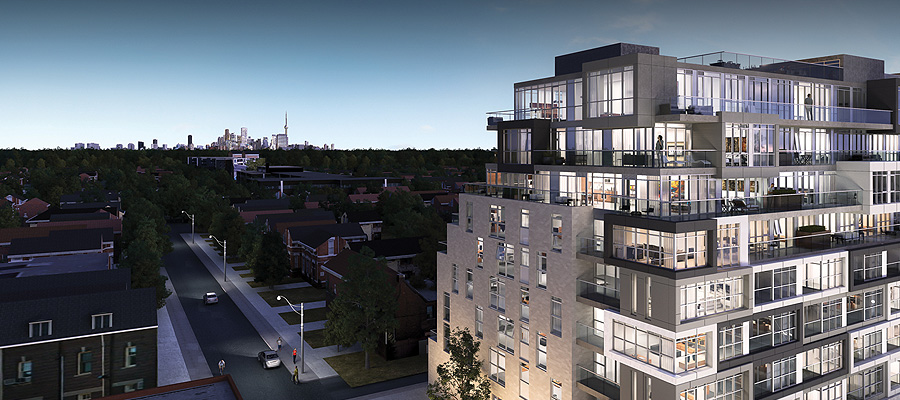
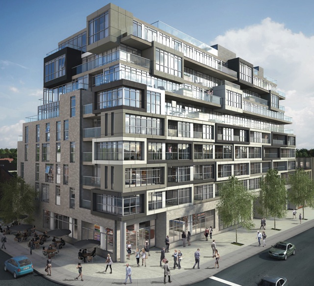
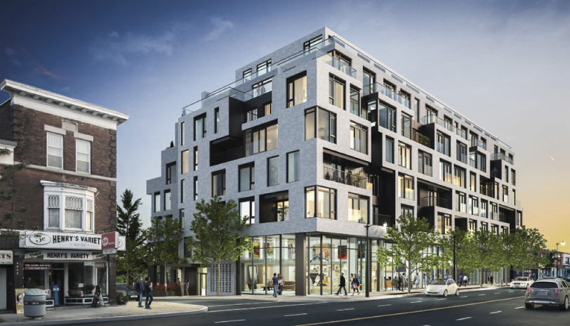
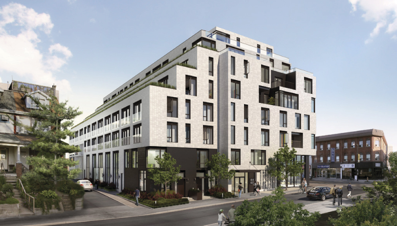
UrbanToronto’s Stephanie Calvet sat down with Richard Witt, principal at Quadrangle Architects, to discuss the inspiration for DUKE Condo’s design. The mid-rise building, which takes its name from an amalgam of Dundas and Keele streets in The Junction, is under development by TAS.

indesign-project-duke_1

How is DUKE different than other recent mid-rise downtown condo projects (King W, Ossington, etc.) in terms of trends and features?

For one, it is a bit bigger than most of the others I’ve done. For example, Cube Lofts has 21 units, Abacus has 42, 838 Broadview Avenue has 40, and Beach Club Lofts has 47 units. DUKE has over 100 units so there is a bit more economy – but the principals are the same. Secondly, DUKE represents a bit of a shift in the market, where mid-rise and avenue intensification is being pursued by a more established developer of historically bigger projects, design-oriented TAS. DUKE also engages with the laneway in an attempt to 'de-service' it to an extent, through the implementation of live/work units (it creates a front door address to the lane and brings in pedestrians rather than just parking and garbage trucks). Lastly, the architectural expression is set up to anticipate a fluid market demand and potential shift: rather than being a composed elevation, it is a direct expression of the unit mix which can be altered through the sales process.

indesign-project-duke_2

What are the guiding design principles that have facilitated the incorporation of a mid-rise into an existing mixture of low-rise buildings, many of which have a historical character?

Although the buildings around have been there for some time, I wouldn’t characterize the context as heritage rich in terms of its buildings specifically, and heritage is a word that’s overused in this city to mean old. The greater history lies in the neighbourhood and area, in terms of the way it has evolved. Quadrangle has historically been known as a company that works to build communities and responds to contextual clues and this project is no different. There are a number of buildings of different shapes and sizes and this project, through its scale modulation and multiple datum lines, picks up on all of those clues. Additionally, it anticipates the future development to come, so when the one-storey buildings are replaced with future buildings of unknown scale, the response to that future context is also anticipated.

As stated by architect Peter Clewes, “In Toronto, we tend to look at the street as a series of individual buildings, not a streetscape.” Considering this is an infill project, how do you think this building adds to the existing streetscape?

That may be the way he’s working, but we always looks at streetscapes and broader context. We do a lot of master planning work which involves understanding walkability, block sizes, designing for end users, mixture of uses on the street and we also work across a lot of sectors including residential, retail, and office, so we understand how they all come together. DUKE provides street-related retail with good height and proportion, innovative live/work unit response to the laneway, and street-related townhouse-type units that form part of the streetscape. The only side of the building in which we don’t address the street is the party wall to the west where there is no street.

image01

There is an interesting breakdown of unit typologies in the project. Given that the price point for mid-rise tends to be much higher, and given that the units are quite differentiated amongst themselves, who is your main target market?

The target market is anyone who likes the character of the Junction and what that neighbourhood is all about. We have worked with local artists and manufacturers to create a building that reflects those values. The unit mix is extremely varied, to anticipate first-time buyers who want to move to one of Toronto’s coolest areas, people who have owned a house in the area for 40 years and want to live in a condo but stay in the area and everyone in-between.

Did the project require an amendment to an existing zoning by-law? And if yes, how has the project been received by the community?

Yes, it has already received approval for that at Community Council. The community response has been overwhelmingly positive: a lot of supportive comments and encouragement to push the design. I think it is a very enlightened community that deserves a great building. The main concern as with all projects these days is traffic – we have done what we can with this building, but a 100-unit building cannot address the traffic and transit problems Toronto is facing…

indesign-project-duke_5

Does the project meet TAS’ ‘Four Pillars of Sustainability’ (social, ecological, cultural, economic) and how?

Absolutely. Community engagement and commitment to working with the artisanal nature of local industry has been a primary principal in launching the project. We have used the design, specifically interior and sales centre (designed by local interior designers Mason Studio) as a vehicle to promote their work via the sales centre and inspiration for the interior design of the building itself (also by Quadrangle). The ecological considerations are primarily manifest in the high ratio of wall-to-window in the building (more insulation) but also in many features throughout, such as the planters on the south side which can be used for growing vegetables, the energized parking spaces (see below) and the high level of metering for all services in the individual units.

Does the building follow the apparent trend of providing a low parking-to-unit ratio and what is the ratio for DUKE?

No, the Municipal Authorities are being much more restrictive in their permissions since the introduction of the new by-law last year. The building is providing parking exactly in accordance with the new (and more onerous) by-law. However we have looked for ways to promote sustainable transportation beyond the abundance of available transit, and have made a specific effort to provide energizing to about 25% of the spaces, and well as provision for future energizing of the other spaces, should the need arise.

Screen shot 2013-10-18 at 1.15.28 PM

Has the double-height retail space been designed in such a way to entice lively commercial venues and deter, for example, the usual corner banking outlets that do not enliven the corners of the city?

It has a very high ceiling, and a potential combination or separation of up to three units. It’s not the right proportions for a bank, and not a great corner for it – my hope is a couple of uses, perhaps a gallery/showroom and some kind of café.

indesign-project-duke_3

What was the inspiration for the common area interior spaces?

The neighbourhood and artisanal industry base.

Was Mason Studio only involved in the showroom design or was it also involved in the interiors of the project itself?

Quadrangle did the architecture and was responsible for the interior design of the building units and common areas. Mason Studio was responsible for the design of the sales centre. However there was a fair bit of cross pollination in the design meetings since the sales centre features much of the interior design for the building, and Mason was in those meetings discussing with us.

indesign-project-duke_4

How will these transitory functions currently held at the building site, such as free mass outdoor yoga sessions and farmers’ markets, contribute to the project’s acceptance by the community?

Hopefully the nature of those events will move forward with the occupants that inhabit the building. TAS has shown enormous philanthropy in utilizing their site for these kind of events and that seems to have engendered a lot of goodwill towards the project.

So far, what has been the greatest challenge on this project? 

The nature and constraints of an urban infill project with so many influencing factors creates a lot of challenges – in the way the building responds to the stable neighbourhood to the south, permits light on to the sidewalk, and stays at a reasonable scale. We face these challenges on every mid-rise project but, though the principals are the same, the response is always different.

Are there any trends in condo building in Toronto that you’d like to see disappear in the near future?

Yes. Lack of imagination, which mostly expresses itself in generic boxes clad entirely in low insulation glazing with “modern design” as the excuse.

Lastly, where do you look for design inspiration?

Nowhere specific, but I'm always on the lookout!

World Architecture News Awards include Big Wins for TO and Canada by stephanie calvet

(This is an article I wrote for UrbanToronto) World Architecture News (WAN) recently announced the winners of the Retail and Leisure Interiors Awards 2012, the most illustrious interior awards around the globe. Whittled down from a bevvy of outstanding international submissions were a number of projects with a Toronto or Canada connection, representing a high percentage of the overall awards. Yay!

Project entries were divided into three distinct categories: Hotels and Service Retailers; Restaurants & Bars; and Retail Outlets (under 200sqm/over 200 sqm). Judges convened in London to select the winners based on the following criteria: "design excellence, originality, quality and mostly, the ability to communicate the historical aspect of a site through its decor.

World Architecture News Awards-5


Taking 1st prize in the category 'Retail outlets over 200sqm' was the transformation of Maple Leaf Gardens, the former home of the Toronto Maple Leafs, into an urban food store and gastronomical mecca for the Loblaws grocery chain. Collaborating with Toronto’s Turner Fleischer Architects, the Aussie firm Landini Associates, who specializes in graphics, strategy and branding, animated the cavernous interior of what was once Toronto's most iconic sporting venue with bright hues of red and orange and larger-than-life typography. The building's history is celebrated through an integrated design approach that incorporates elements from its past: stadium lighting, murals, and a 12m x 12m Maple Leaf sculpture of old stadium chairs. Landini Associates won the big prize and then some, matching the client's initial request of “world's best food store” by creating a hub "Super" "Market" that not only seeks to engage the local community but draws visitors from far and wide.

Top-Interiors-2012-11

World Architecture News Awards-7

Other wins didn't come for Toronto locations, but two more Toronto-based firms did very well.

In the category 'Restaurants & Bars', Toronto firm Yabu Pushelberg, known internationally for creating luxurious and refined interiors, won for the grand reopening of the legendary Pump Room restaurant in Chicago. The firm partnered with celebrated New York hotelier Ian Schrager in the re-imaginging of the Ambassador East as chic modern Public Hotel on Chicago's "Gold Coast."

Juxtaposing classic and modern elements, Yabu Pushelberg reinvented the Pump Room, capturing the glamour of the venue's celebrity-filled past and historic club-like atmosphere. The new interiors are striking: a neutral palate dominated by more than 100 hanging celestial resin orbs, bleached-oak tables, and swanky leather chairs. Just as the iconic space was revisited so was the menu, its original classics recreated by world-renowned chef Jean-Georges Vongerichten.

World Architecture News Awards-8

World Architecture News Awards-4


On the shortlist with no lack of accolades is the Joe Fresh New York City Flagship by Toronto interior design firm Burdifilek. The launch of the Canadian retailer into the U.S. market wowed the jury with a showroom that takes over two floors of an historic bank building at the corner of 5th Ave and 43rd St. It's a dazzling sight inside and out, an airy glowing interior showcased through SOM's iconic 1950s glass façade.

In order to protect the historic features of the modernist building—once-dubbed the “Crystal Lantern” by Lewis Mumford—none of the shop fittings were drilled into the floor, walls or ceiling. Instead, the design provides for custom free-floating wardrobes crafted from white, powder-coated metal with sandblasted Lexan panels that can be easily reconfigured by Joe Fresh’s merchandising team into vignettes. The wardrobes seamlessly incorporate monitors, mirrors or backlit billboards to feature clothing and accessories. Joe Fresh bold-coloured urban fashions stand out against the all-white interiors, much like the brand's clean aesthetic.

World Architecture News Awards-2

World Architecture News Awards


There is design life in Canada unconnected to Toronto, and an instance of it in Quebec has also landed a major prize.

Hôtel La Ferme by Montreal-based architectural firm Lemaymichaud took home 1st prize in the 'Hotel & Service Retailers' category.

This contemporary take on country hotels in Baie-Saint-Paul impressed the judges with its efforts to preserve the site's colour and authenticity by emphasizing 'craft' and 'local': locally-sourced materials and items, and the showcasing of artisans' work. La Ferme includes barn-inspired wood elements throughout and, fanned out across five pavilions, its 145 rooms and lofts feature various types of rooms with distinct personalities, from railway-themed sleeping quarters with pull-down beds to botanically-themed décor alluding to the site's past vocation in agriculture. The design pairs modern pieces against woven traditions of old, capturing the charm of the Charlevoix region and telling the story of the historic setting.

World Architecture News Awards-6

hotel_la_ferme_6